In the world of cut-throat competition, there is a saying that ‘Time is Money’. The more time devoted is equivalent to more money invested. With an email “scanned” in 11 seconds, it is necessary to deliver the right information to your subscriber in concise time. But no two subscribers on your list may be on the lookout for same information.
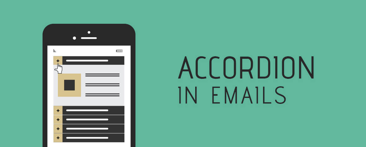
The dilemma between content length and content specifics is eradicated with one of the most innovative interactive element…. Accordion effect for Emails.

How it works
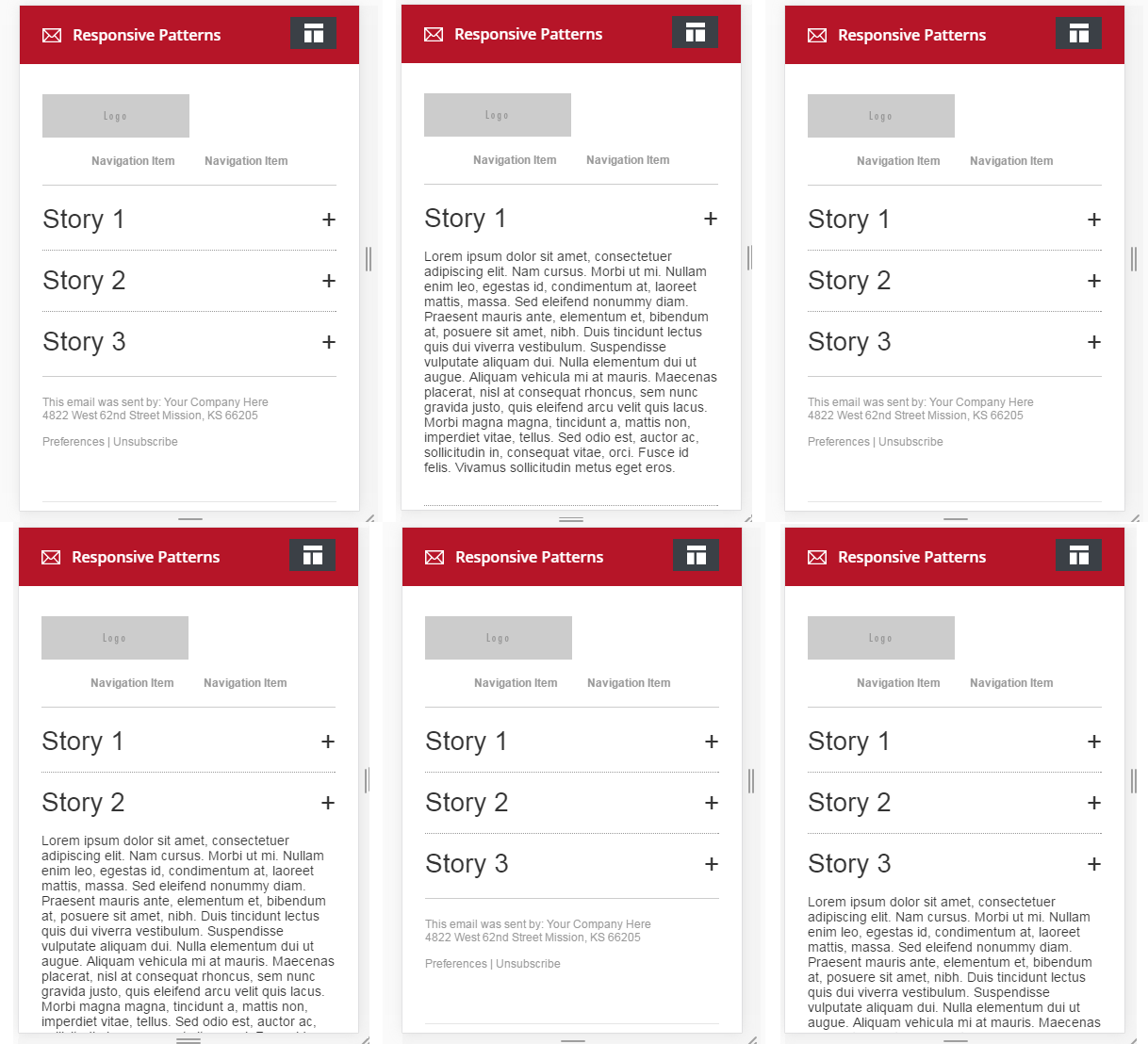
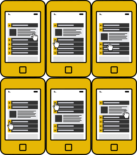
With the help of interactive elements in email like Accordion, the content of your email can be categorized into tabs which expands or contracts based on user interaction. This way your email can cater to various information without increasing the overall length of your email. Moreover, the end-user also gets the choice of skip to the information of their interest.
Advantages
Stack-up your content: With Accordions, emails could stack up the content into smart categories and accommodate a lot of content in a sleek way. By collapsing the information and showing just the titles, almost 600% of vertical space is saved (assuming a paragraph is five lines and a title is one line long).
Copy would not kill the UX: Content-heavy emails are not something your subscribers appreciate. So, if you are an email marketer who needs to share a lot of content in your email; you can actually use Accordion to improve the overall UX and at the same time save user time providing them option to read what they like.
Measure the information consumed: There is no well-defined way to measure how much of your email was read (like Heatmaps for websites). With Accordion, marketers can measure the clicks on the tabs and identify which area of information was of more interest to the subscriber. A well-versed analysis can then help you improve your next email strategy.
Compatibility and Limitations
The Accordion will work only on mobile email clients that support external CSS only. So Windows-based clients, Gmail app and third party apps shall not support it.
Native Android and iOS email clients shall render Accordion as WYSIWYG (What You See Is What You Get).
Application
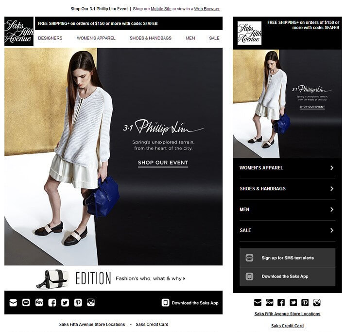
- Retailers as always could show many products with different information clubbed in Accordions.
- Media and technology companies can show various information within their emails.
- Accordions are sure-fire ways to actually send feedback emails with a questionnaire.
Real World Examples
Email Uplers :

Property Dreams:

Saks Fifth Avenue:
 Nu Yu:


Few Best Practices
- Consider finger targets of mobile users while placing the Accordion and content therein.
- Don’t overload Accordion with too many categories. It will create a clutter and make it hard to act upon.
Interested to receive a sample of Accordion effect in your inbox? Contact us now!


Kevin George
Latest posts by Kevin George (see all)
Seasonal Email Templates: Add Hues To Your Email Campaign
Tooltip in Email: One More Interactive Approach