At a Halloween costume party, people usually tend to dress up as an entity or symbol that is either deemed conventionally scary or that they are terrified of confronting at a personal level. So, it is not uncommon to see people come dressed up as spiders, lizards, zombies, skeletons (or sometimes…just themselves), and the like. At this party, if one of the attendants is a marketer, there’s a good chance that you’ll see them dressed as the smallest slice of a revenue pie. Okay, okay, I might have stretched that a wee bit, but I’m not THAT far off, you’d agree?
To lend credibility to my argument, let me give you some context. In 2022, Halloween spending reached an astronomical $10.6 billion. Now, the thought of not being able to grab any portion of that lavish spread is downright terrifying, isn’t it? Want to get in on the party?
Simple: Focus on crafting powerful email campaigns.
Running short on inspiration in that regard? We’ve got you covered! Today, we will walk you through a host of pixel-perfect Halloween email templates that are sure to get your creativity gears whirring. Can’t wait to see what’s in store? Dig in right away!
1. Magic Spoon
Subject line: Build your own Halloween treat bag!

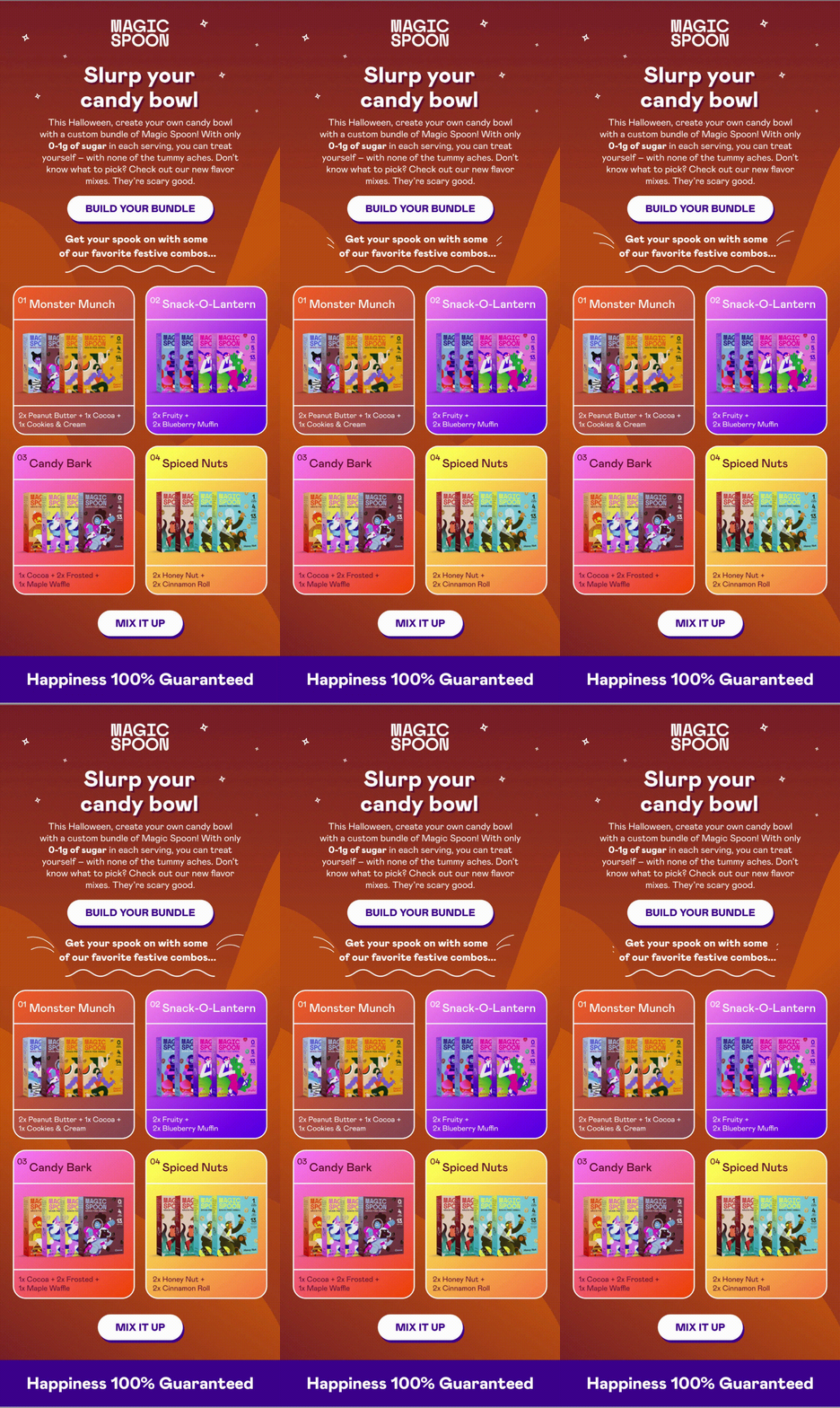
Why go trick-or-treating when you can instead curate your very own candy bowl? No, we are not making this up; this is precisely the super-tempting proposition that Magic Spoon put forth in their Halloween email!
On the design front, this email is an absolute delight; the use of gradients both in the background and foreground renders a brilliant visual appeal to the email. Each bundle in the email has been assigned its distinct color code; as a result, the email’s readability is greatly enhanced. What makes it count among the best Halloween email examples out there is the addition of minor animated elements in the email (the line strokes and the stars) that introduce a degree of dynamism to it, giving the reader that much more reason to keep their eyes glued to it. The CTAs over here pop out in the literal sense of the term thanks to the blue stroke that has been added to them- a simple yet highly effective maneuver, ensuring that no reader loses sight of them.
Although the copy in the hero section of the email is a touch extended, given the brief length of the email, judicious use of line spacing prevents it from making the layout appear cluttered.
2. Framebridge
Subject line: So cute, it’s scary 🎃

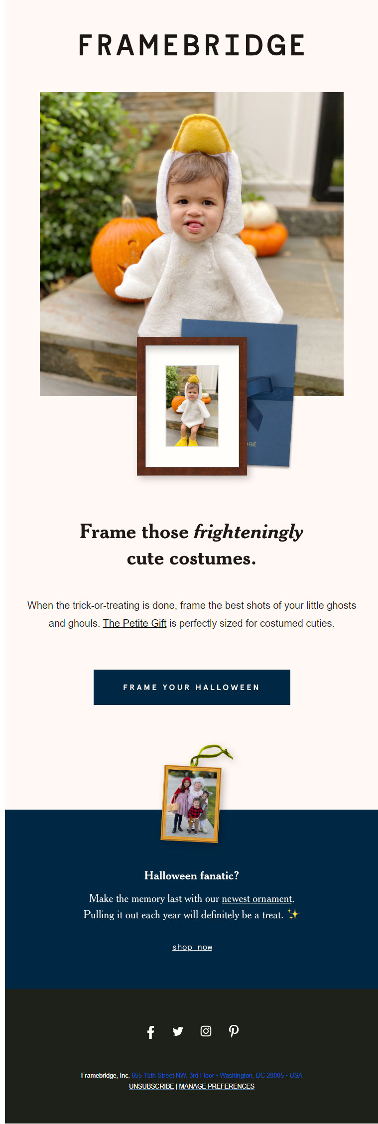
For every parent out there, the first trick-or-treat outing with their children is an incredibly special occasion. And for a third-party observer, it is an impossibly cute spectacle to behold. Framebridge’s Halloween email proposes to preserve this very memory with the help of their offerings. Of course, conventionally, no one would associate anything remotely cute with Halloween email templates. However, when your marketing team is as astute as the folks at Framebridge, you don’t have much to worry about.
Here, Framebridge gives their subscribers a solid reason to buy their product rather than simply imposing it on them; this is a tactic that all veteran salespeople can surely get behind. Speaking of design, the email charms us with its minimalism, both with respect to copy as well as design. Generous use of white space lends ample breathing space to the email, which makes navigating through it an absolute delight. Even though the email contains just the one CTA button, there’s no way you’d miss it, for it contrasts brilliantly against its background. In the email footer, one can spot the social media icons, the unsubscribe link, and the manage preferences link.
3. Food52
Subject line: Halloween treats so delightful, it’s scary.

Amidst dishing out the characteristic spooks and scares, some folks carve a reputation for themselves as treat-givers extraordinaire, courtesy of the delightful spread of candies they hold in their possession. If you, too, want to break into this coven, Food52 is more than willing to give you a helping hand.
Their Halloween email example does a masterful job of showcasing their offerings- an inviting copy gently guides readers to an array of delectable visuals, making it nearly impossible for them to leave their virtual shopping carts unpopulated. Aware full well of the fact that festive emails are better off being visual-friendly, Food52 has curated this email majorly with high-quality pictures of their products. That said, the copy, while succinct, isn’t necessarily utilitarian; it packs enough punch to persuade the readers into making a purchase. At the same time, Food52 has also managed to strike just the right balance between text and images, as a result of which this email is extremely easy on the eyes. Not to mention that doing so also keeps them safe from the ire of ESPs.
4. Fun.com
Subject line: Feel that? 🍃 Spooky Season is coming! 🎃
While using emojis in the subject line continues to be a debated-upon subject in the email marketing world, brands are usually allowed to commit to them for special occasion emails. And when you are doing it as tastefully as Fun.com has done with their Halloween email subject line, you can definitely afford to breathe a little easier.
Coming to the email, they have strived to give you three adjectives to associate with their spooky season offerings. And to ensure that these get etched in your mind, they have used two visual prompts- the product’s image and an icon representing the adjective. Now, we’d be remiss not to dive deeper into the images used in this email’s hero section. Why? Because they are user-generated content! Using UGC in campaigns that get sent out during high-traffic times is a great way of ensuring engagement.
Apart from using images, Fun.com employs an animated GIF, too, to showcase their offerings. Being replete with visuals, the email is fun to engage with. At the same time, adherence to an ideal text-to-image ratio prevents it from overwhelming the senses. As you scroll toward the bottom, one comes across clear instructions using which readers can share user-generated content with the brand. The footer contains a host of important links, including social media buttons, blog, unsubscribe, manage preferences, view in browser, and privacy policy.
5. Shinesty
Subject line: Your Halloween Underwear Has Arrived
Shinesty’s Halloween email makes a glorious case for itself, all thanks to its excellent use of humor. When it comes to making an impression on your reader, few tools are as effective as humor. It can fetch immense success for your Halloween email marketing efforts. Here, Shinesty has executed another highly clever maneuver, too- they have embedded the humor into a dynamic visual element (GIFs). Having made sure to catch the subscriber’s attention with their hero section, Shinesty then proceeds to pitch their products (again, through a GIF) in the subsequent portion of the email.
Witty wordplay in the CTAs further incentivizes the readers to take action. The footer of this email is exemplary. Rather than simply adding social media buttons as is common practice, Shinesty has gone the extra mile to inform their readers about the idiosyncrasies of each of their social media accounts. Further, the name of the email copywriter has also been revealed to establish a personal connect with the subscriber (coupled with a beautiful, heartfelt note!).
6. sweetkick
Subject line: How to recover from a sugar hangover
While trick-or-treating is extremely fun, too much of a good thing can sour the experience. It is this very vein that sweetkick touches upon in their Halloween email. Recognizing the fact that some people can be very indulgent with their Halloween treats, sweetkick puts forward their offering in a bid to tackle the malaise that can result from it. At the outset, this email serves as a fine example of how you could go about crafting your Halloween email subject lines. Moving on, a non-fussy copy sheds light on the product, and a high-resolution image ably supports it. The constituent ingredients of the solution are mentioned, along with their individual medicinal properties. When subscribers have such clarity regarding a product, they are automatically more likely to consider buying it. Two things stand out about this email’s design:
1. The soft tone of the background is in total sync with the nature of the product being discussed- calming and soothing.
2. The single-column layout makes for easy navigation, making the email that much more consumable.
7. Meri Meri
Subject line: Get ahead! Find the perfect Halloween costume 🪄
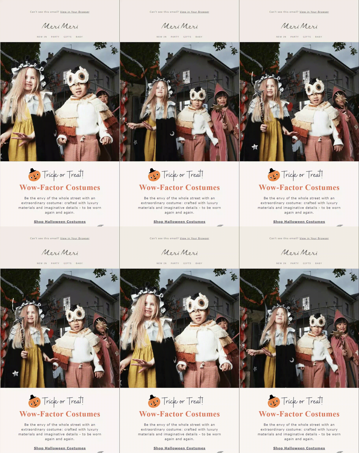
Adding GIFs to the hero section is, in our books, an excellent tactic, particularly when it exhibits the brand’s offerings. Wouldn’t you also want your offerings to be the first thing a reader sees as soon as they open the email? In their Halloween email campaign, Meri Meri showcases three different types of costumes to their readers. Each category is furnished with its own copy and photo grid, which makes the email rather engaging. In the email footer, along with the social media and Unsubscribe links, one can find a Contact Us link as well.
8. Email Uplers
Subject line: Something wicked this way comes

With our Halloween email, we have strived to foster cross-channel engagement and interaction. In the email, we have invited our readers to participate in a simple and fun emoticon quiz. At the end of their attempt, we encourage them to share their responses on their Twitter handles and ask their friends and followers, too, to partake in it.
Manufacturing cross-channel opportunities is something that many brands strive towards when it comes to special occasion email campaigns, and it is surely a tactic you can consider embracing for this year’s Halloween email campaigns.
Wrapping It Up
Your head is abuzz with Halloween email marketing ideas aplenty after having scrolled through those emails, surely! All that remains now is to breathe life into them. As always, we are rooting for you!


Rohan Kar
Latest posts by Rohan Kar (see all)
Bulk Email Campaign - Let's Weigh Out the Pros and Cons
Getting It Dunn: Everything You Need to Know About Writing, Designing, And Sending Out Dunning Emails