Email marketing is always undergoing changes, big and small. The kind of campaigns, the focus of messages, and even the design and typeface—the best practices on all of these and a zillion other critical elements get revamped every now and then. But, there are certain aspects of customer-centered communication that stand the test of time.
The same goes for the eCommerce segment, which is incidentally and obviously heavily dependent on user-focused missives. At every point, online brands need to know what, when, and how to communicate with their users. A large part of this happens through email, with automated, personalized, and targeted campaigns sent out to email subscriber lists.
Here, we are taking inspiration from some striking email templates sent out by different eCommerce brands in recent years. Information, promotion, re-engagement— a whole host of purposes are served by these email marketing samples.
For easy reference, we have presented them based on the center point of their message and email marketing strategy.
User-Centric Emails
1. Look Them Up For Loyalty
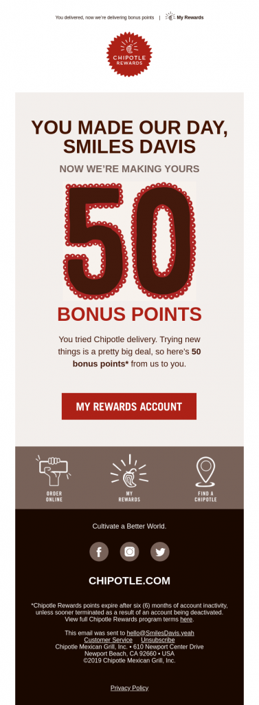
This email type is one of the best ways to assure the customer they are up front and center in all your campaigns. Chipotle, here, has kept it sweet and simple. The design and color template work—the contrast, in particular, is quite apt for a food brand. The playing-up of the number is also a case of subtle, positive affirmation.
The copy makes the point, but it could have been a little more streamlined and better aligned in tone with the CTA button. The subject line, “Bonus points are the new thank you,” could have been less typical and more impactful.
2. Serve Up Statistics
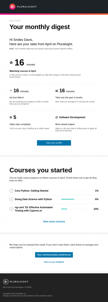
Sending out properly compiled and pleasantly toned user-based reports will always work to develop a customer connection. We can’t think of a better example of email templates that really make good use of personalization AND data—two must-haves for email marketing these days, especially for eCommerce.
Pluralsight has seemed to nail their “monthly digests” in the example above. The white space helps to bring the focus on the template, text, and data. The design elements are simple yet effective, especially the progress bars. The relevant links have been integrated nicely. The contrast of the grey text could have been turned up just a notch, but that’s our only quibble.
Brand-Centric Emails
1. Notify New Products
Brands typically never miss their new product announcements, but there are different ways to do it. What’s not to love in this child-focused email template from Epic for Kids? The tone is thoughtful, speaking to parents who’d be the receiving user in these cases. The images are well-rendered, as are all the information tidbits. We also like how all the relevant brand “bytes” have been fitted in between.
Every line of the content is super-focused on the user groups—both parents and children—and speaks well to the “what’s in it for me” element. Color combo, check. Consumer-friendly CTA, check.
A point worth noting: a colorfully hectic, “crowded” design such as this template may not work for all brands or in most cases. You can also experiment with a bare, simple, and sleek design, like Warby Parker’s below. They have also gone the creative route with a small but clever GIF of the new product in the bottom-third of the email.
2. Capture The Changes
It’s always good to give your subscribers/customers a heads-up on any changes, whether to your offerings, the site, or anything else, so they are completely tuned in and feel informed. Google has done it well here with a clean and clear email template. The design and the copy are well-matched with the brand’s overall voice. The subject line, “You’ll love the sound of this,” and the lead-on CTA are niftily nuanced. The out-of-ordinary text alignment works.
We were also struck by this template from STATE The Label, which is more text-heavy but has tried a few different things. The message is on-point.
Content-Centric Emails
1. Woo With Video
Content marketing is a buzzword these days, as you’d know. A clever way to integrate this in your email marketing campaigns would be with product-focused content, such as tutorials.
You can integrate these in your “Welcome” emails to effectively pitch your blog/website content to your newest customers. Remember, they are new, so you have to take the effort to help them get the lay of the land.

The Universe brand has done it well here, outlining multiple elements and USPs of their services. The two-toned black background, the font (both typeface and color), and the use of mod tints and design elements are all attractive. Only, the subscriber-directed disclaimer is a little too lost at the bottom. (Learning: Make sure every part of the template serves its purpose!)
Miche Beauty, too, has us inspired with this crisply communicated “manual”. The images are smartly selected and well-rendered, and all the relevant prefacing to their blog and video are there. The design is executed nicely, with pleasing brand hues. The CTAs—both to call out the brand’s content calendar and the collaborative payment feature—are well-placed.
2. Nostalgia For The New Year
You can tie the bow up neatly on your campaigns with an annual wrap-up, also leaving a trailing end with a welcoming note for the year to come. This can include both brand-boasts and user-centric highlights like Uber has done here, or just one of the two.
We love the crowded but engaging design, and the data dished up here. The multiple-color combination works, somehow! The brand’s globalization, in particular, is oh-so-cleverly captured in the text along with the little design elements. Their CTA is well-thought-out and is sure to have garnered conversions aplenty.
Transaction-Centric Emails
1. Bolster The Browsing
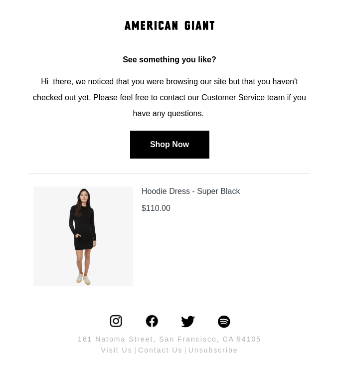
Let’s face it: in this day and age of ‘spoilt for plenty’ and shorter attention spans, every order transaction that goes through (quickly) is a cause for a tiny celebration. You have to reach out to your customers—potential or repeat—and egg them on. A straightforward, helpful message, like the one American Giant has crafted here, should do the trick.
Their design is scaled-down and effective enough for a browse abandonment email. You can consider adding product images and details of similar styles and collections. You can also be ultra helpful and fit in a link to your customer chat service or just a toll-free number to direct any queries your browsers may have.
2. Combat The Cart Abandonments
Shopping cart abandonments are always going to be one of the biggest challenges eCommerce brands are going to face. But marketers can always do their bit to help the customer cross the line and commit.
Toolstop has captured all the elements we outlined in the previous section in their template here. The design stands out with the image and the bold font (screams “Don’t Abandon!” doesn’t it?), and we love the use of the product colors along with the brand palette. The spaced-out segments make for neat navigation. They have even thoughtfully added little buttons up top for user-centric functionalities.
3. Dot The Line On Deliveries
A basic communication for any eCommerce brand is around order delivery updates, especially in these days of mobile integration. Chewy has got it quite right with this template, which has all relevant details and links included. The product information and images might seem extra, but they can work as a reference for many customers. A simple, white-toned design like this would suffice in most cases for these emails.
4. Talk Up The Timeout Sales
Promotions of sales are always a good talking point to ratchet up your transaction metrics. The key is to create a good, positive sense of urgency. Michael Kors CA has done a neat job counting down to the end of their summer discounted sale with a pared-down design. Quite a bit of thought has gone into the color palette, you can tell, and the predominantly black-and-white design comes off well. The product and generic images blend in perfectly.
Source
Feedback-Centric Emails
1. Seek With Survey
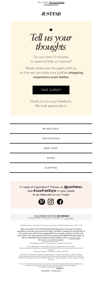
Emails that are centered on feedback are essentially future-forward. One of the best ways to chart your path ahead in eCommerce is with feedback, and a standard but effective way to get it is a survey form. A simple email—talking from the customer’s PoV, obviously—will go a long way, also to secure the trust and buy-in of users. JustFab has pulled that off here with a pleasing, segmented design, tone-perfect copy, and cleverly integrated elements for their social proofing strategy.
If you can do it, it’d be great to offer an incentive on the side to complete the survey, as Signature Hardware has done here. The template is catchy enough and is sure to get a good CTR, but their overall message and design could have been more streamlined and focused, perhaps?
2. Onboarding And/Or Ongoing
You can also check in with newer customers by soliciting feedback on their experience thus far. You can do this as a part of your onboarding strategy or even continue it periodically with your high-value customers. We think Bellroy here is smartly doing a bit of both!
Source
This template, sent to a 30-day-old customer, really stands out for its engaging copy. The images are brilliantly positioned and crisp, and the color contrast is one of the best we have seen. The design is purposefully minimalist and succeeds in playing up the content and CTA.
Wrapping Up
So, those were our inspiring email templates of eCommerce brands across 10 different email marketing focus points.
Here’s a shortlist of tips based on what has worked across these samples:
- Use a good combination of images and text, and streamline the design. Have your copy do all the talking, as far as possible, only amplified by the design elements.
- Ensure your template is clear, concise, and captivating, both with the design and copy.
- With every line of the design and the copy, bring the focus on the customer. Make sure your tone is positive, friendly, and engaging.
- Include all the necessary links and a distinct CTA. Don’t forget to include elements for social media and social proofing where relevant.
- Focus on building your subscriber/customer base, but always give the opt-out for unsubscribing from your newsletters/a particular email series.
- Last but not least, don’t forget your opt-in emails in this day and age of data regulation and privacy.
We hope these ideas have provided plenty of inspiration to amp up your customer communication!
Looking for more expert guidance to craft the perfect eCommerce email templates?
We can also take over for you.










Kevin George
Latest posts by Kevin George (see all)
Dos and Don'ts of Email personalization with SFMC
How to Use Visual Hierarchy and Mind Motion to Optimize Your Banner Ads