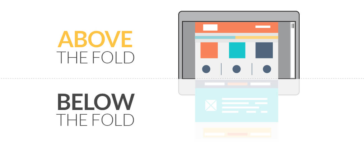
The word “Above the Fold” has typically been derived from the newspaper industry. Newspapers are folded by default and thus editors wanted to showcase important headlines right in the front fold. This space stands a lot of prominence as the reader reads this section of the newspaper first.
Adapted from newspapers, the words “Above the Fold” and “Below the Fold” are now also being used while designing an email. The vital information and CTAs are placed at the beginning to instigate an action initially. However, this could be not true always.
There are many debates about putting efforts to drive engagement using the folds in email. Above the fold could be crucial as an average email is read for only 51 seconds, but this can also hamper and obstruct the overall design goals.
Challenges
– Your content in the fold might not work out all over as there are multiple resolutions and devices
– Fold will also change depending on horizontal and vertical preview pane
– These concepts will change furthermore with emails wrapped around on your wrists. Yes, wearable and other smart connected devices.
Newspapers are now obsolete, but email is alive and well. Thinking fold? Think twice!
Uplers walk you through some tips that will not hamper your design goals and at the same time enable you in placing CTAs at the right spot without jogging the gray.
1) Carve a Story
Give users a good reason to scroll. Let them explore the email by creating a story starting from the top of the page. A curiosity at the top of the page can encourage a reader to scroll down the page. Marketers can highlight discounts & offers at the top and ask them to scroll down to identify the entire offer. You can then use multiple CTAs at various stages.
2) Use the power of preview pane
Most of us hamper the thinking to fold, but if we start providing enticing content right ab initio in the preview pane, things might change totally (email designs in specific) Using appropriate preview pane and pre-headers will encourage users to scroll and engage with the CTAs irrespective of their placements.
3) Stack up the content together
With an increase in the on the go recipients, the text should be managed cleverly. Use of accordion and menus can prove significant to utilize the space judiciously.
Instead of stuffing a lot of visible text in an email, it is beneficial to simply tell the user that there is more content for them to see with the help of an accordion and menu. This may power a reader to click on accordion and read more content in each section or rather simply click on the menu and redirect to an entire page.
4) Adjust the blocks to create curiosity
At times the length of the content doesn’t really matter. This is especially true when your email has different blocks for different target audience. For desktop users there could be a different layout with different CTAs within the folds however, the same could be drastically overhauled for the mobile user. You can also use content blocks and images in a way that there is clear indication and curiosity about a CTA in upcoming folds.
5) Identify the clicks and engagement
You should not stop monitoring your user behavior so to ensure placing CTAs at the right spot. Measure it in relation to the most commonly used screen resolutions and then place the valuable content in a way that gets the most clickthroughs.
Takeaways
Lately, some people feel that “The Fold” does not stand much importance while designing an email. However, this could be relative and you can only test your own results. You need to ensure providing value in all your email campaigns and if they do, users will surely scroll down to engage with your CTAs. There are various email advancement techniques that we offer which may also be helpful in eliminating the issues related to fold.


Kevin George
Latest posts by Kevin George (see all)
Are your emails IOT compatible?
Top 20 Black Friday & Cyber Monday Email Inspirations
1 thought on “Is “FOLD” hampering your design goals? Tips to consider!”