With the increasing challenge in the world of online marketing, making your brand stand out amidst the extensive competition is a tough task. However, banner designs serve as a compelling medium that can help you in raising brand awareness effectively. It isn’t only measurable but comes with a low cost too. This, in turn, makes it one of the most productive forms of marketing in today’s competitive digital world. So, how can you leverage banner designs and bring out those clicks? All you need to do is follow these tips and you will be good to go.
1. Banner size matters
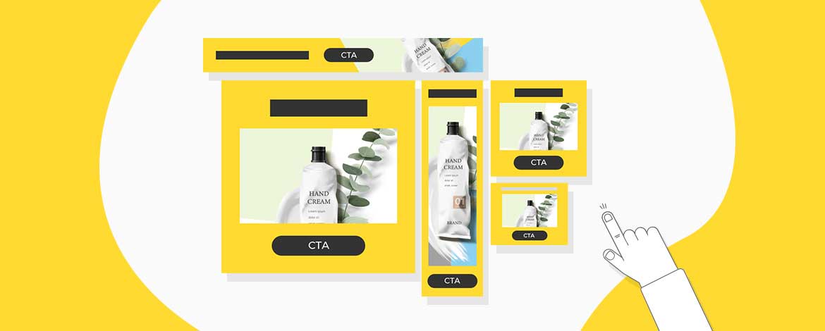
Banner size plays an imperative role in making your campaign a successful one. It works to entice people to click-through your ad. So, opting for a standard banner size is a must. Take a look at the ideal banner sizes.
● 336 by 280
This banner size comes in square shape.
● 300 by 250
This banner size comes in medium rectangle shape. It either floats on the right side or is embedded within the text elements.
● 300 by 600
This banner size comes in the form of half a page.
● 320 by 100
This banner size fits in as mobile banners.
2. Correct banner placement counts
Your brilliant banner design and content wouldn’t matter anything if it’s not correctly placed. Therefore, it is critical to position your banner in such a place where everyone can view it. The best place to put your banner is either above the fold or close to the main content of the page. Remember, the effectiveness and beauty of a banner would only yield results if it is clearly visible.
3. Simplicity is the key
With people spending less than 15 seconds actively on an online page, your banner ad should be all about giving more in less content. In short, your banner design should have concise copy along with being simple and to the point. It would make your message clear instantly and give your prospective customer a thorough idea about your brand in the first 2 seconds itself.
4. Go for the right button placement
Buttons play a critical role in increasing the click-through rates of banner ads. So, make sure you place it at the most apt place. Usually, it is put after the copy in contrasting colors. It makes them pop up while grabbing the customers attention instantly. Remember, buttons are not about being attractive and elegant. If you wish to motivate your prospective customers to convert into your loyal buyers, even a simple “shop now” or “discover more” can do the needful for you. Also, the consistency of buttons is important throughout the ads.
5. Focus on fonts
Banner ads are all about small spaces and have a lot of competition to cater to when it comes to grabbing the customer’s eyes. Therefore, it is important to go big with the headline and use a smaller size for the body copy. You can use something that’s colorful and bold to instantly catch the customer’s attention. Strong typefaces that are simple to read can also help you make your banner game strong. In addition, make sure the font size is not less than a 10pt. Keeping your copy to four lines or less can also help you get to the point smoothly.
6. Include simple in-Ad animation
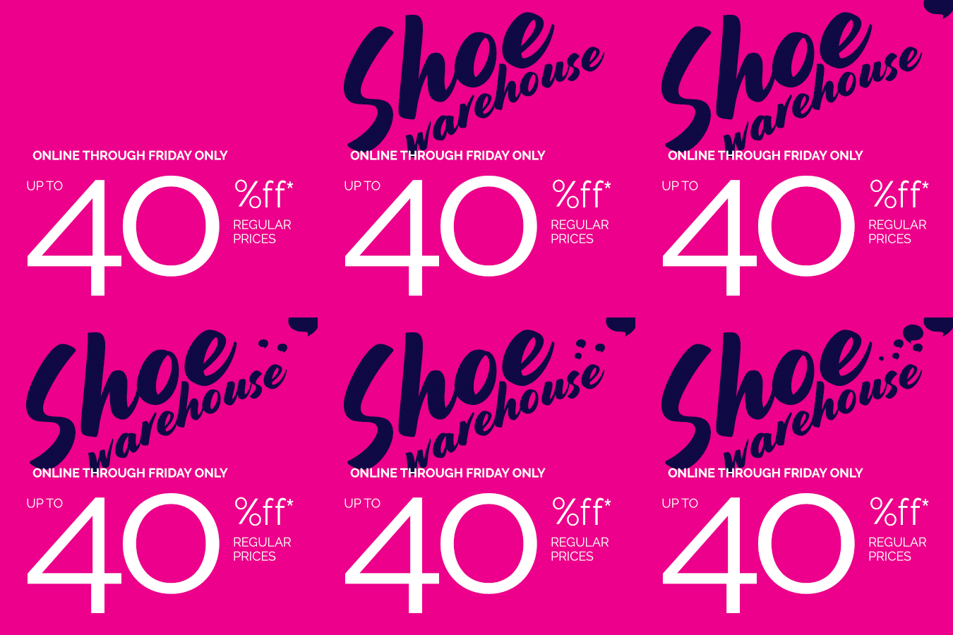
Animated banners as compared to static banners resonate instantly with the customers. It is a great approach to quickly hold a customer’s attention. According to a study by Microsoft, the average attention span of humans is 8 seconds. So, you see how animated banners can work wonders for your brand? However, make sure your animation isn’t too loud and doesn’t distract the customer from the actual message. Take a look at the animated banner below.

7. Add relevant and appropriate images
Your banner ad must have images, photos or graphics that hold relevance to your brand message. Make sure to include high-quality images. After all, blurry, unattractive images are going to do no good to your business. High resolution images greatly enhance the user experience. You can either go for professional photography or buy a license for a stock photo. Opting for genuine paintings and graphics can also help you deliver impeccable results.
8. Be consistent in your approach
Consistency is important in banner design to avoid confusion for customers. The banner ad landing page has a link to the user offer. So, ensure that the banner ad and the landing are consistent to each other. Banner ads work as an expansion of your marketing campaign. So, they need to resemble each other. From using the same shades and typefaces to including similar images, there are a lot of ways to maintain visual consistency.
9. Go for the right colors
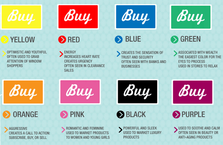
Color is the first element that a user notices in a banner ad. So, choosing the right color plays a critical role in the success of your banner ad campaign. Remember, different colors have different meanings in different cultures. It is subjective and tends to evoke different emotions. While some colors attract people, others just pull them down. Hence, keep your target customers in mind and choose your banner colors wisely. Here’s a detailed view of different colors that can be used in digital marketing.

10. Keep the visibility clear
As mentioned in the points above, the banner ads should be clearly visible to prospective customers. Consequently, the graphic advertising rights should be extended to the edge, the frame should be clean. A contrast colored frame within the framework of the frame can help your banner stand out amidst the competition.
11. Go for A/B testing
A/B testing your banner ad will help you extract as much information as possible from your customers. As a result, you will be able to create a banner that would best suit the interests of your customers. However, make sure not to indulge in too many variables. It might lead to inconclusive results.
Wrap up
That’s everything you need to know about creating impeccable banner designs. Follow these tips and see how you create outstanding banners that will not only enhance your click-through but conversion rates too.


Kevin George
Latest posts by Kevin George (see all)
APNG in Emails: Taking Animations to a New Level
How to Leverage Post-purchase Review Emails