Landing pages are the powerhouse of business growth. When done right, they can take your conversion rate to the next level. If not, all your effort and time will go in vain. You can have different landing pages according to the purpose of the campaign and the source channel. One such landing page that is often overlooked and needs your attention right away is the PPC landing page.
So, let’s get started…
Defining PPC Landing Page
A PPC or pay per click landing page is a dedicated web page that is used for paid campaigns on platforms such as AdWords and Bing Ads. You can target your prospects with specific phrases and demographics and they will land on the respective landing page.
For example: If you search for the term best project management tool, you will see this ad:
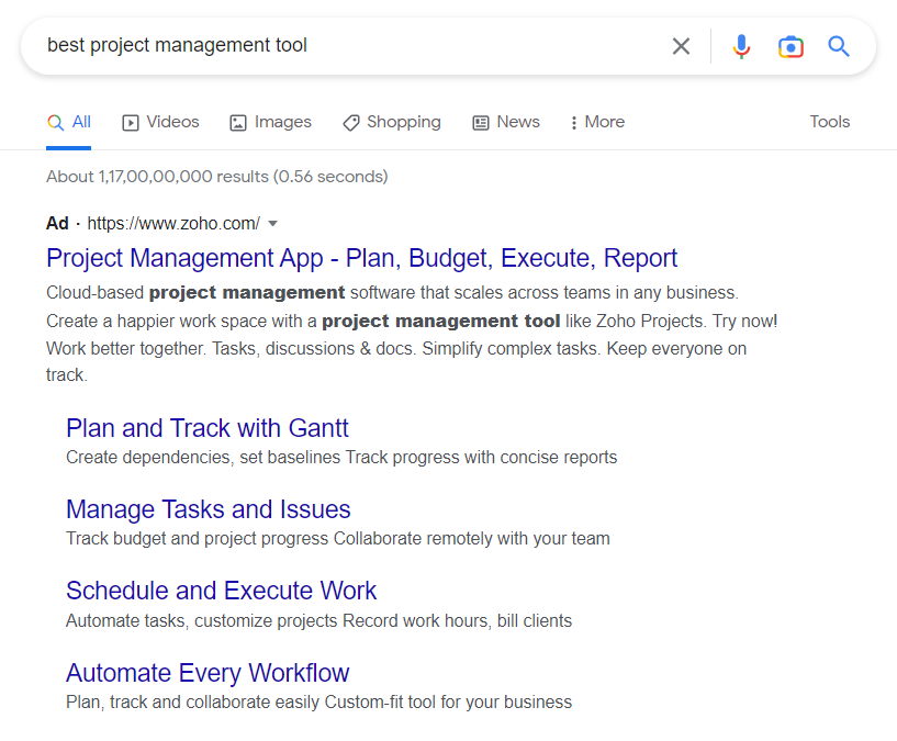
As the ad adheres to the PPC best practices, the users will be keen to read more.
When you click on it, you will see the landing page shown below.
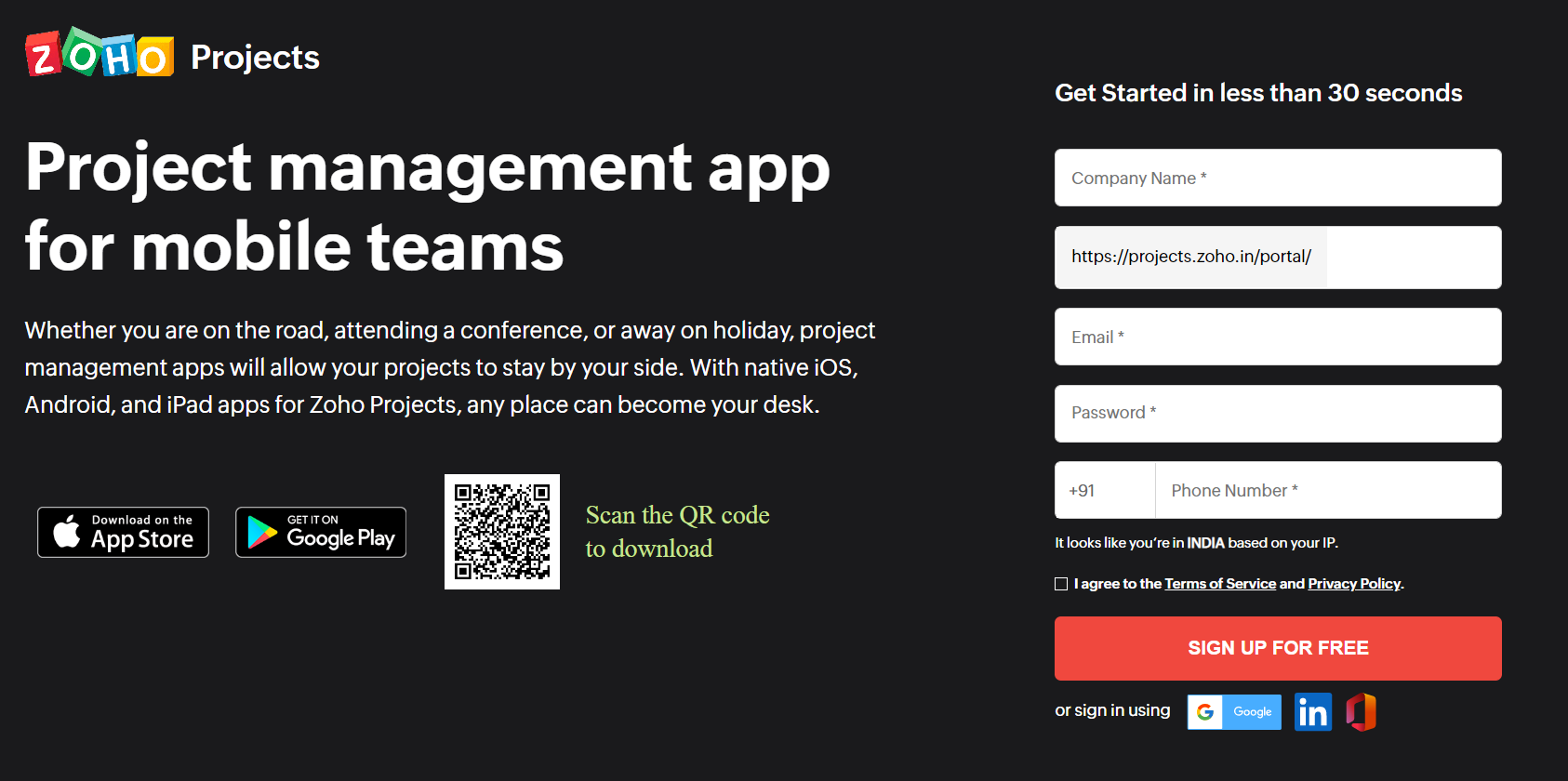
This web page is the PPC landing page. You must conform to certain best practices for landing pages to get maximum clicks and make it work.
Here’s a detailed insight into PPC landing page best practices:
1. Your PPC landing page should be relevant
Irrespective of the source channel, your landing page should always be relevant to the user’s needs. When a user clicks on your ad, it means that they have found something they are looking for. As an instance, suppose you are looking forward to buying a domain name.
Here are the PPC ads you will see when you search for the keywords “buying domain name”.

When you click on the ad, you will be redirected to this landing page:
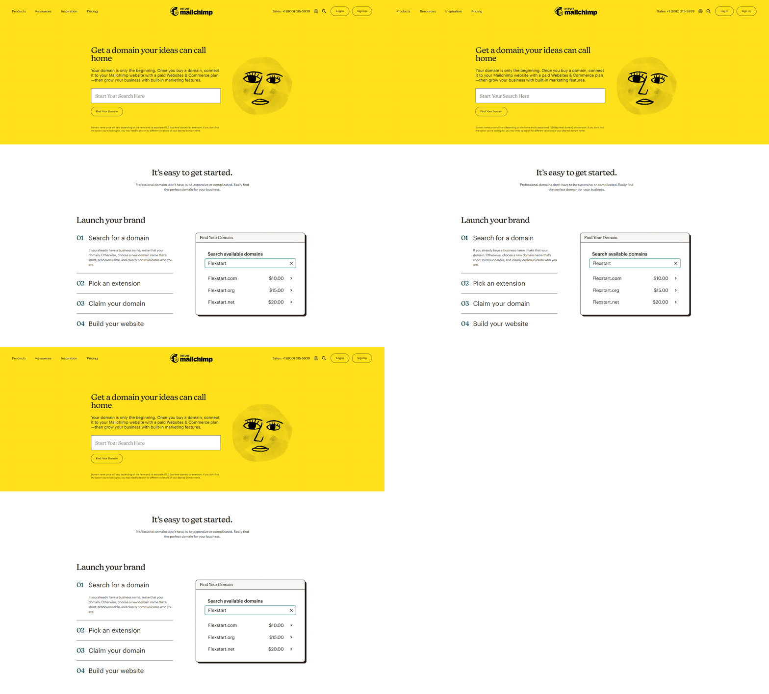
It perfectly matches the requirements of the users and serves them what they are looking for. Also, do you notice that it includes the keywords they want to bid on? For example: Domain name, website, choose a new domain name, etc.
2. Write the copy for the buyer personas you want to target
Your landing page content and visuals should be in line with the intent of the target audience. The best PPC landing pages should address all the concerns that the user might be having before making the purchase decision. For example: When you search for SEO services, you will see this ad by Bluehost.

On clicking the ad, you will see the landing page shown below:
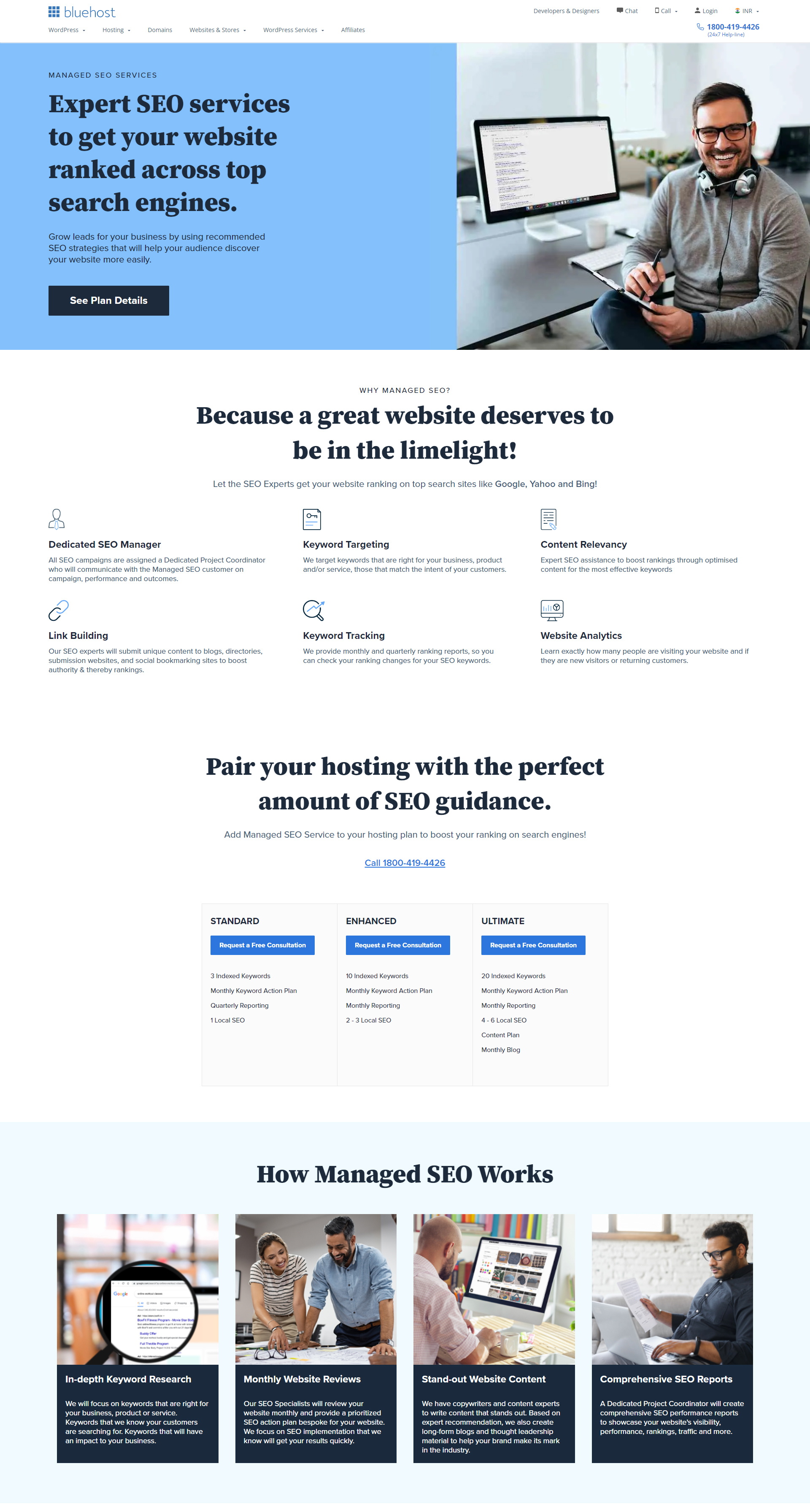
It clearly communicates how the reader can make the most of their services.
3. Focus on a minimalistic design
Your users are busy people. They won’t have time to read long essays and they are looking for quick information. If the landing page offers them easy resolution of their issues, they are likely to convert. So, take a minimalistic design approach to make the message stand out. Write a succinct copy and incorporate plenty of white space.
Take a look at this PPC landing page design by Wix.
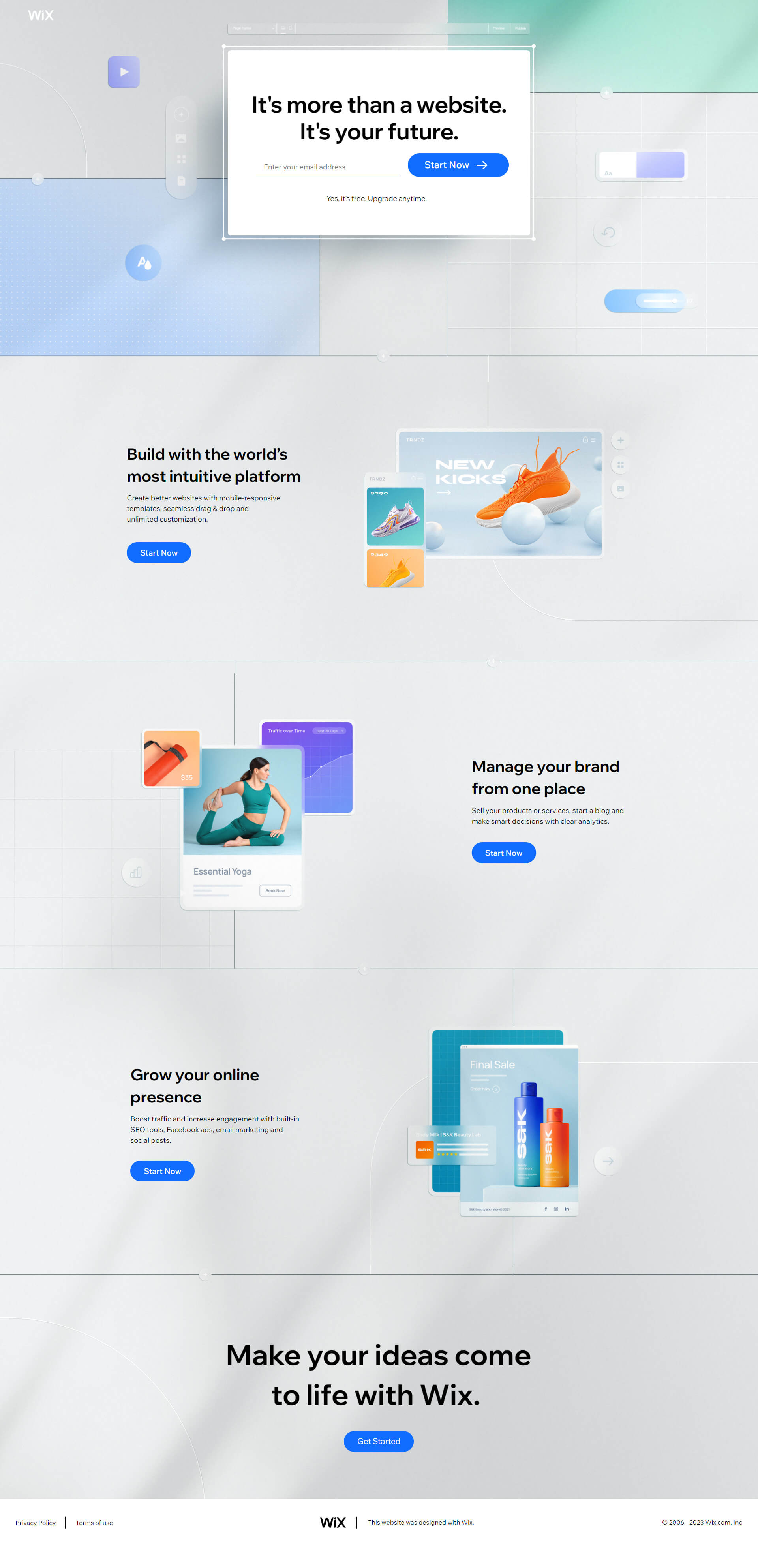
It is a minimalistic landing page that conveys all the necessary information without any distractions. They have included a single field form that will help generate leads faster. You can then ask for more information in the subsequent forms. Multi-step forms work the best as they help you target the users with personalized content.
Now, if you look at their website home page, it is visually richer and much more comprehensive.
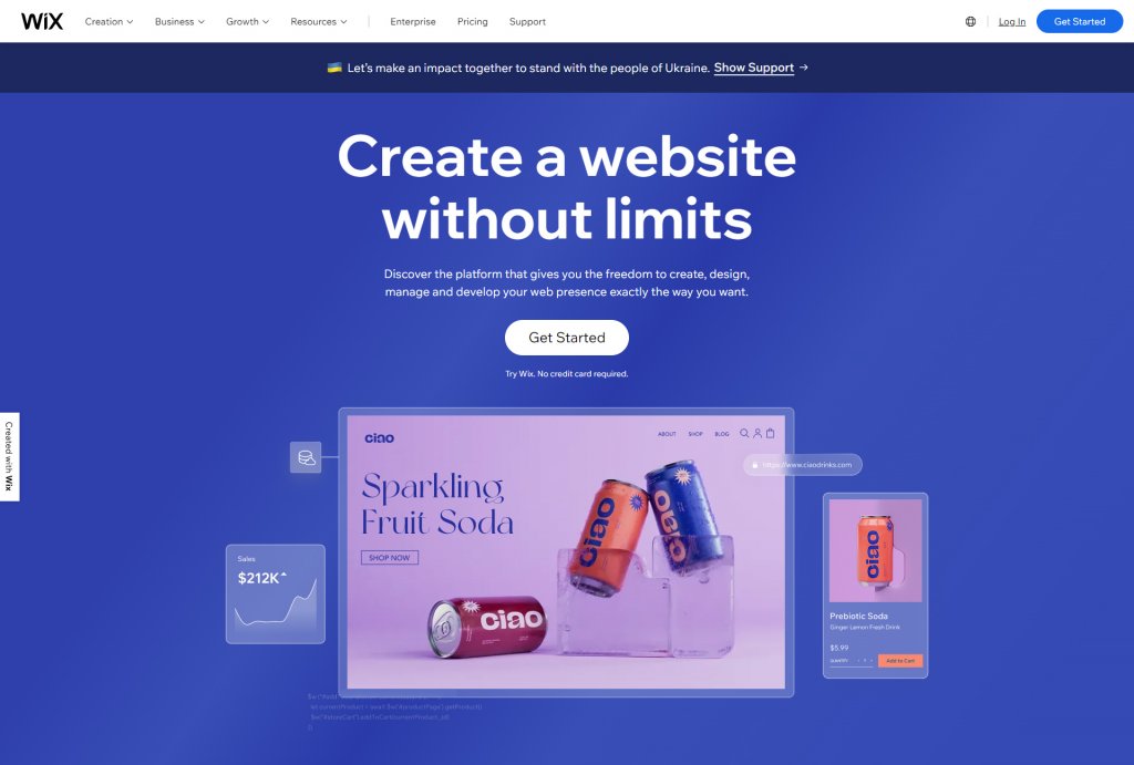
Many brands use the website home page as the PPC landing page, which might affect their conversions. Since the user has landed on your PPC landing page after clicking on your ad, their intent is pretty clear. So, it should simply focus on converting them rather than educating them.
4. Present your value proposition to the readers
You are not selling just a product to your prospects. You are selling an experience, an assurance of making their lives easier. The PPC landing pages should underscore all the salient features and benefits of using your products.
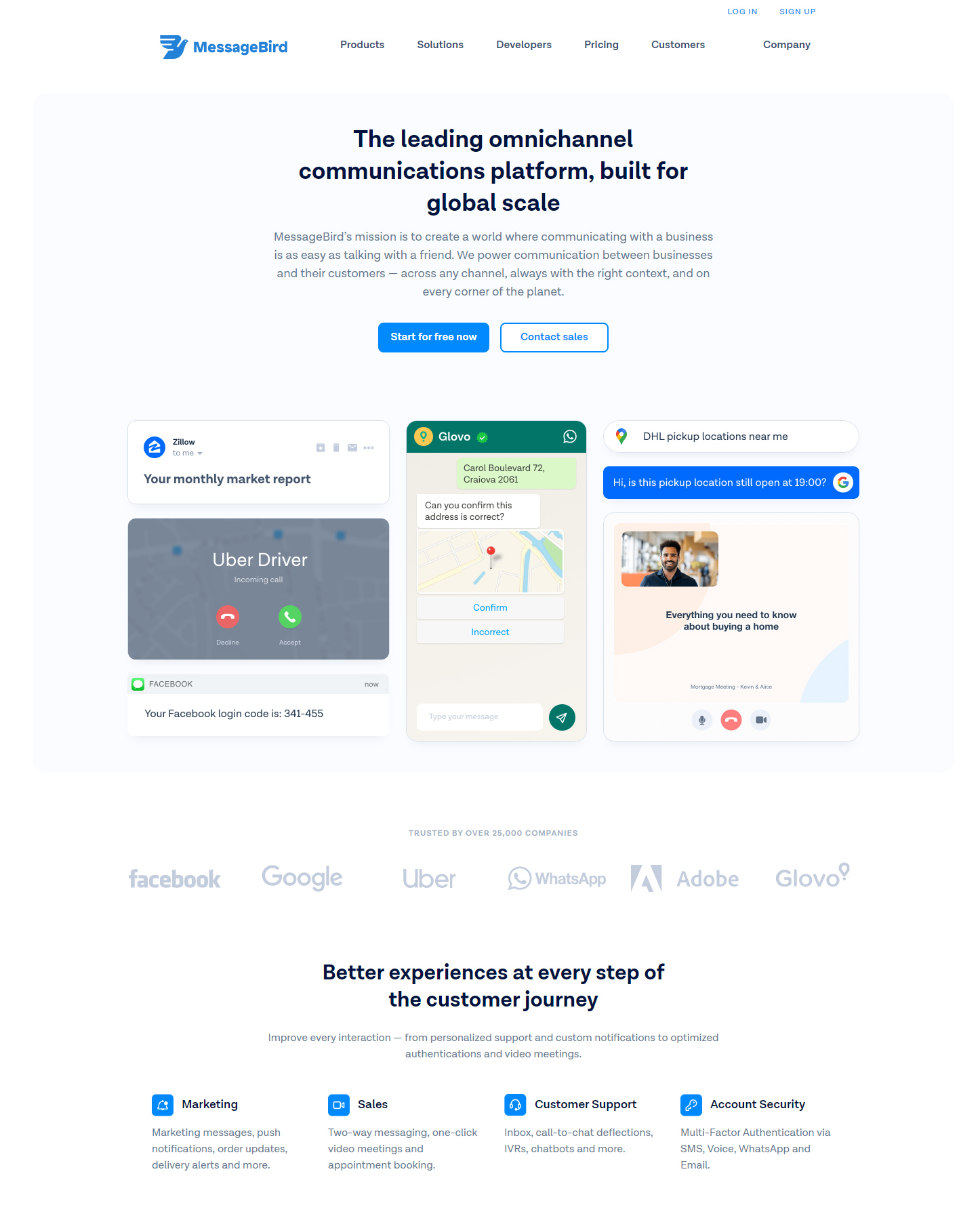
Take a look at this PPC landing page example by Messagebird that has highlighted all their features and explained how it will strengthen communication between businesses and customers. The headline is enough to pique the reader’s interest and get them scroll till the end.
5. Add testimonials to support your claims
When I was in Los Angeles last year, I didn’t have access to private transport. That’s when I searched for car service in LA and the PPC ad by Executive Car Service LA.com caught my eye. I clicked on it and landed on the landing page shown below. It is one of the best PPC landing page examples I have come across.
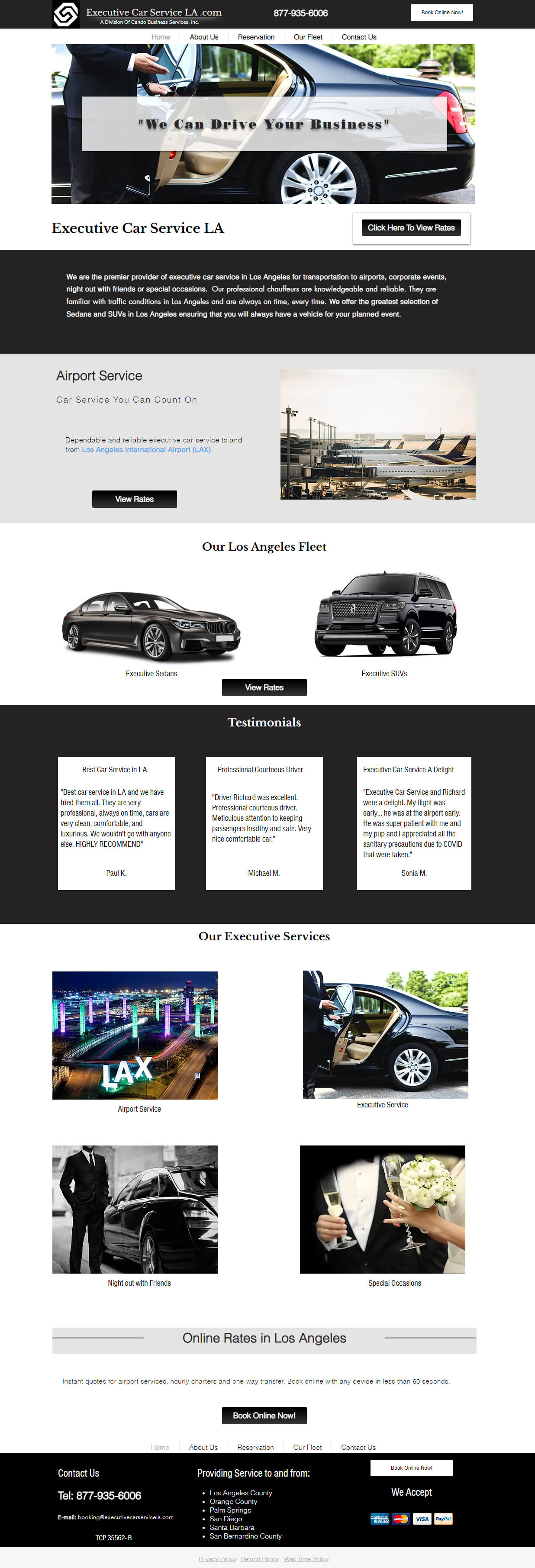
As I was new in the city, initially I was a bit reluctant to avail their services. But, the testimonials on their landing page, affordable pricing, and instant booking relieved me of all the apprehension. Needless to say, their landing page played a big role in instilling trust and driving my decision. Similarly, if you are in the SaaS or B2B industry, you can use case studies, awards, certifications, social media mentions, and reviews on TrustPilot, G2, or Clutch to gain your customer’s confidence.
6. Add the right visuals
Apart from reviews, testimonials, and case studies, there’s something else too that can make or break the reader’s trust. It is the visual elements you have used. Succinct copy and right visuals go hand in hand. Choosing relevant pictures will eliminate the need to write any lengthy copy while making the landing page more impactful.
Avoid using overused stock images or royalty-free photos from the Internet. Your readers have already seen enough of that. Instead, go a step above and invest in illustrations, 3D images, or animations that will strengthen your value proposition.
If it is a PPC landing page for a product, add animated photographs that offer a better understanding to the users.
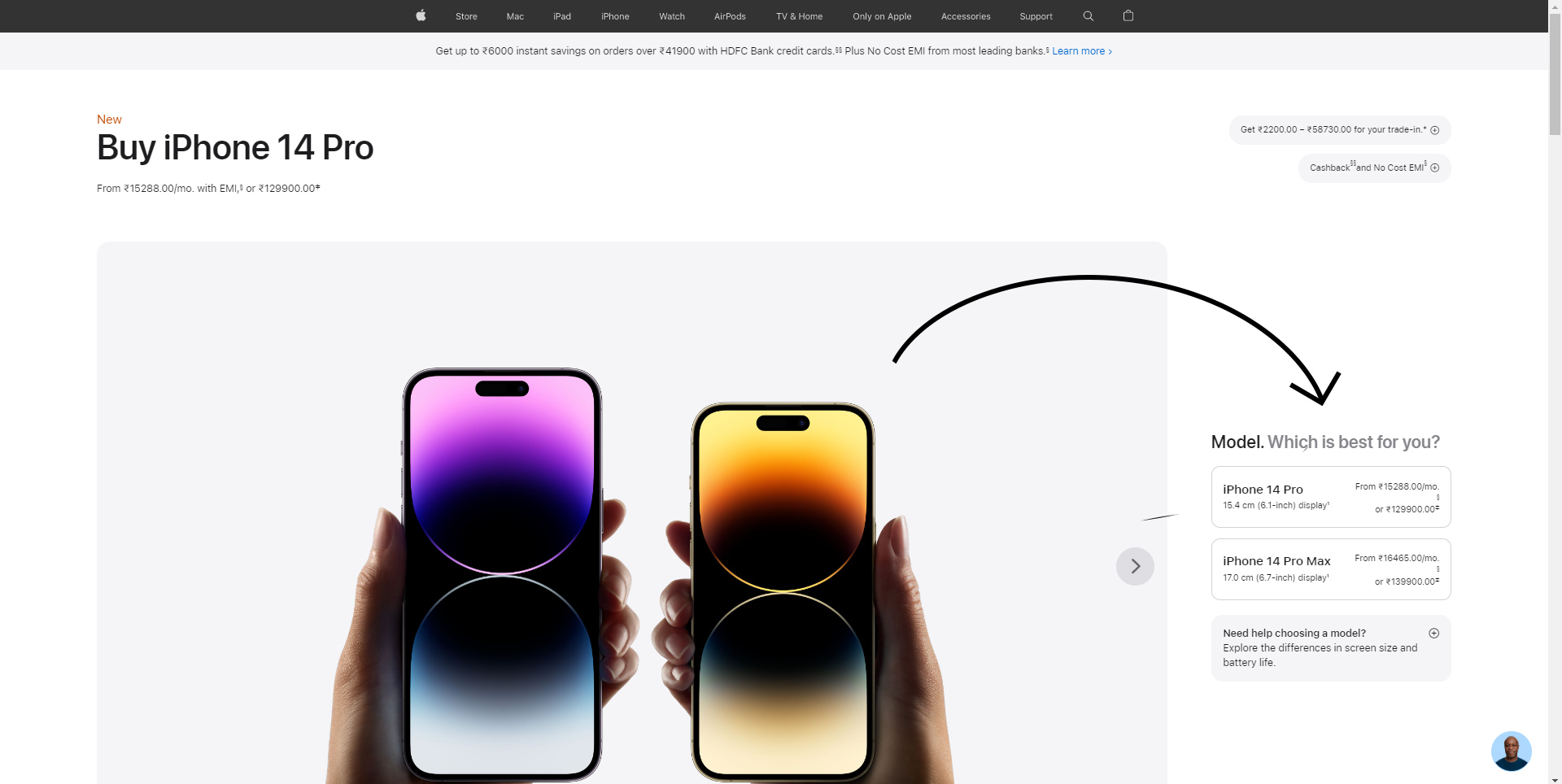
To illustrate, take a look at this PPC landing page by Apple.com. It gives the users detailed information about their iPhone 14 Pro model. Users can choose the model of their choice and the imagery will be adjusted accordingly.
Another thing that is commendable about this page is that they have given the option to connect with a support executive in case the user needs help. It will eliminate any barrier to conversion.
7. Make the landing page interactive
PPC landing pages need not be over-informative and boring. You can incorporate some interactivity to encourage reader engagement. It will also draw their attention and keep them from bouncing away. You don’t need to go overboard with complicated interactivity. It can be as simple as in the landing page shown below:

They have included a simple downward arrow that will encourage more users to click on it and read further. If you need help in creating interactive PPC landing page templates, you can try out our landing page design services.
There’s something else too that is on point in this landing page.
Read the next point →
8. Tap on FOMO
The user has searched for something you offer and clicked on the PPC ad. Now, how will you increase the chances of conversion?
You will find the answer in the landing page by The Forum Shops.
They have drafted an intelligent copy that creates a sense of urgency. “Last-minute deals” and “Score big savings for a limited time only in-store” are nice catch phrases to get maximum footfall at the store.

9. Have a primary and secondary CTA
Unlike the popular opinion of having a single CTA, the best PPC landing page templates have a primary and secondary CTA.
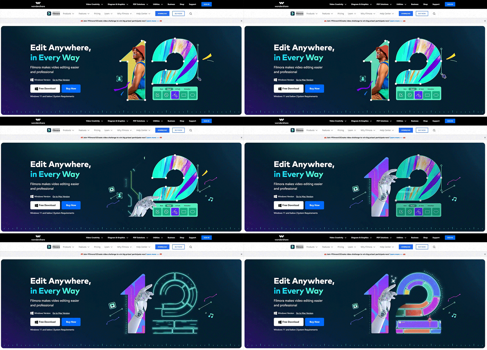
Take a look at this PPC landing page by Filmora.
They have added two CTA buttons in the first fold.
The primary CTA button is “Buy Now” while the secondary CTA button is “Free Download”.
It will prompt more users to take action as they get the option to download it for free in case they do not wish to shell out money and buy.
10. Make the PPC landing pages mobile-friendly
Many users will be landing on your ad/ landing page through handheld devices. Impart a smooth experience to them. Just follow the PPC landing page best practices below:
1. Keep the copy as crisp as possible
2. Use light visuals that load quickly
3. Disable pop-ups for mobile devices
4. Have a responsive single-column layout without stuffing too much information on the landing page
5. Test it for rendering so that you don’t have to lose out on conversions because of a broken layout.
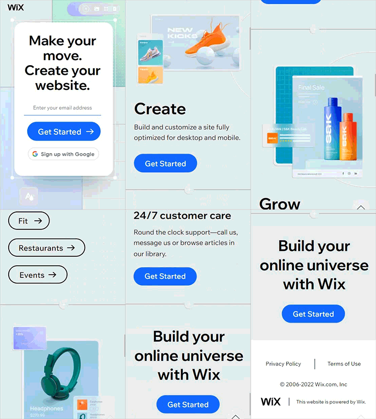
Here’s how the PPC landing page design by Wix renders on mobile devices. Sleek, right?
Wrapping Up
The objective of any landing page is to earn the reader’s trust and convert them. With PPC landing pages, you have an advantage that the user is already interested in buying. You only have to convince them to buy from you.
To reiterate: Try to stay ahead of your competition by writing an engaging headline and copy, picking the right visuals, and innovating with new ideas. The bottom line is to propel the users further in the sales funnel and compel them to purchase.
Do you have any other best practices for landing pages (especially for PPC ads) to share? We would love to hear from you.



Disha Bhatt (Dave)
Latest posts by Disha Bhatt (Dave) (see all)
Email Sender Reputation: Learn The Art of Improving Email Deliverability
The Email Personalization Guide You’ll Want to Bookmark