How many times have you checked emails on your mobile after just waking up?
Most of the time, right? That’s exactly the case with your subscribers too.
Rather than having to switch on the desktop or laptop, we prefer to check emails on the go. As many of the companies have gone remote, even work emails are being checked online.
Litmus observed similar findings in their recent survey. They revealed that 42% of all emails are being read on a mobile device making it most popular while 40% of them are being accessed on webmail. Desktop stands at 18% and Apple iPhone at 28%. If you consider iPads, it will make an additional 9%.
There was a time when email marketers used to send fixed-width emails. When such emails are accessed on mobile devices, the user has to keep swiping right and left to read the email. It is quite a demanding task when you have a pile of unread emails in your inbox. Therefore, responsive email designs came into the picture.
What do You Mean by Responsive Designs?
In simple words, responsive email designs help you to display your email properly, regardless of the size of the device used to access it. Creating such email designs is quite similar to responsive web designs with some changes in the execution.
Advantages of Responsive Email Designs
1. Responsive email designs will take the subscriber experience to the next level.
Your subscribers can easily navigate through your email as they do not need to swipe across, pinch, or zoom through the screen to read the content. Having tappable CTAs works as a cherry on the cake, as it allows you to impart a pleasant subscriber experience and increase the likelihood of conversions.
2. It skyrockets subscriber engagement
By making the email designs responsive, you can boost subscriber engagement. As a result, the unsubscribe rate will be low and so will be the spam complaints.
3. It helps to yield a bigger (and better) ROI
People are mostly shopping online through their mobile devices. Therefore, sending a responsive and properly rendering email will translate to a better click-to-open rate and better ROI, when compared to a non-responsive email.
How to Design a Responsive Email?
To design a responsive email, an email developer takes the help of fluid tables, images, and CSS media queries so that the content flows smoothly across the various screen sizes. These media queries transform the fixed-width tables and images on desktops into fluid elements that render well on small screens.
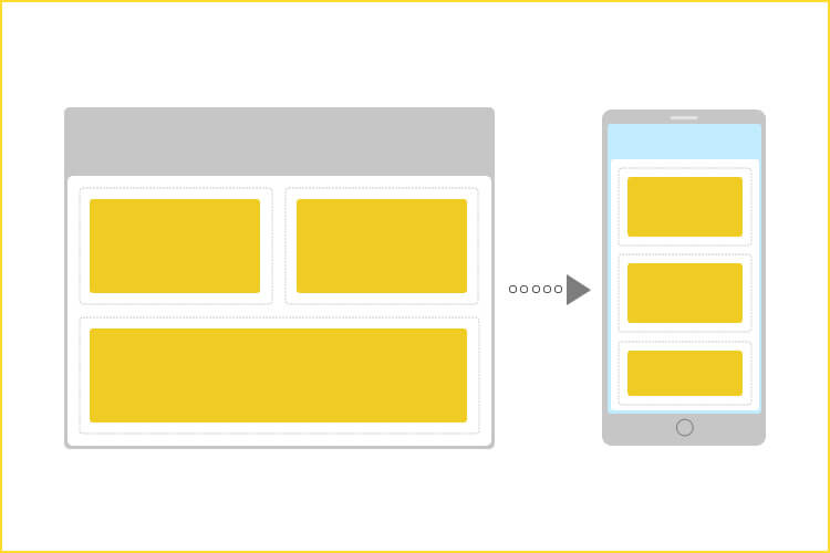
The basis of designing responsive emails is to make sure that the columns stack gracefully according to the screen sizes.
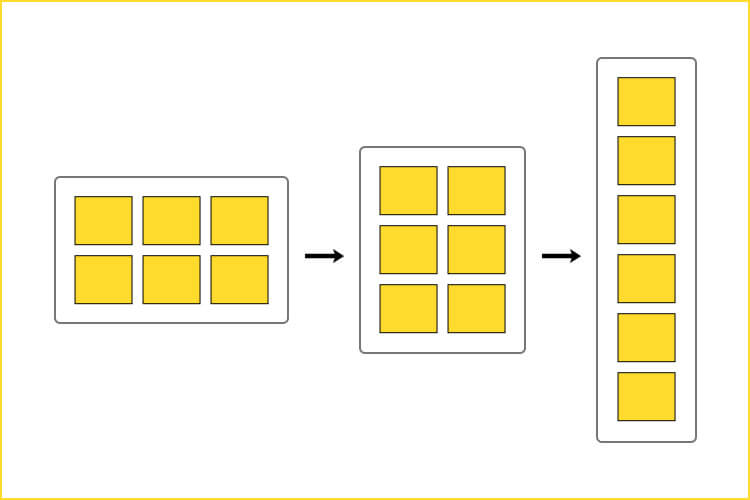
Let’s see some of the basic points to remember while creating a responsive email template.
1. It is advisable to have a single-column layout that is in the range of 600 to 640 pixels. It makes the email more readable on the small screens of mobile devices.
It is not necessary that your desktop users will have a full-screen window to check the emails. Therefore, you must always design your emails in the ‘vertical’ mode. In simple words, rather than using a landscape mode, design your emails in the portrait mode.
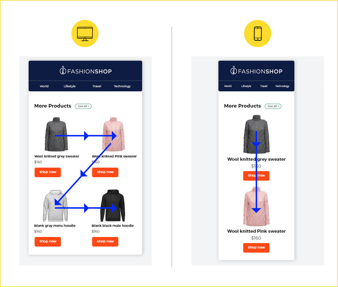
2. As Apple guidelines suggest, keep the links and buttons at a minimum size of 44 x 44 pixels.
3. For iPhones, the minimum font size should be 13 pixels. If you keep the font size smaller than that, it will automatically get upscaled and lead to a broken layout.
4. Draft a short and sweet email copy so that the text blocks do not take up too much space and add the important visuals in the first fold of the email as far as possible. Have enough white space in the emails to give breathing space to the readers.
5. It is a great idea to use the code mobilehide{ display: none !important;} in order to hide some content when the email is accessed on mobile devices.
6. Include small, responsive images with suitable alt tags so that you can convey the message even if the images are turned off in the email client. For retina screens, you must add images at 2x.
You have to use attributes like width:100%; and max-width:x;
This sounds like the 1990s coding technology but that’s how designing responsive emails works even in 2021.
7. Always test your emails across different email clients and devices for proper renderability.
8. Lastly, let me tell you about ‘visual hierarchy’.
To design an email that renders well on mobile devices, you must follow a logical order which means that:
a. The first section must have a header image, supporting content, and a single call-to-action.
It will reflect the primary purpose of the email.
b. The second section can have smaller sub-sections with a number of calls-to-action.
Here, you can display the products or offers that will hook the reader to scroll through the entire email.
c. In the third section, you can conclude the email by highlighting your USPs.
Coding Tips for Responsive Emails
Flexible layout and media queries are mainly used to code responsive emails.
Any layout in emails is made using tables in the email body. Tables are nested within outer tables to generate appropriate layouts.
<table border="0" cellpadding="0" cellspacing="0" width="600">
    <tr>
    <td>
    <table>
           <tr>
               <td>
               <img src="images/xyz.jpg" width="280" alt="" />
               </td>
           </tr>
           <tr>
               <td>
                   Hello World
               </td>
           </tr>
    </table>
    </td>
    </tr>
</table>
This table shall make a table containing an image and a comment, nested within a larger table (of 600px) as shown below
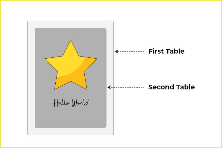
To make this above table flexible, you need to add the tag class= ‘wrapper’ to the outer table.
<table border="0" cellpadding="0" cellspacing="0" width="500" class="wrapper">
The class=”wrapper” is defined by the media query. Media query makes use of defined breakpoints, as per which the layout gets rearranged according to the device.
@media screen and (max-width: 599px) {

          .wrapper {
width: 100% !important;
}
So the final code looks something like this:
In the above example, the media query is only applicable to those devices whose screen width is below 600 px. The class=”wrapper” ensures that the table is aligned to 50% for the above media query.
@media screen and (max-width: 599px) {
              wrapper {
width: 100% !important;
}

           }

           .
           .
           . (Here come remaining CSS code for defining other
           . styles and header of your emails)
           .
           .
           .

<table border="0" cellpadding="0" cellspacing="0" width="550">
    <tr>

       <td>

          <table>

                <tr>

                     <td>

                          <img src="images/xyz.jpg" width="280" alt="" />

                     </td>

                </tr>

                <tr>

                     <td>
                           Hello World

                     </td>
                </tr>

         </table>

      </td>

   </tr>

</table>
!important is necessary as inline styles overwrite styles contained in media queries. In such case, the only way for the styles in a media query to take precedence over inline styles is by using !important.
Compatibility of Media Queries
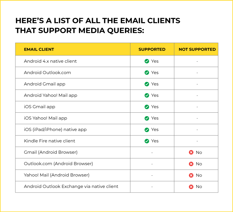
Apart from responsive email designs, there are two more types of designs that you must know about.
1. Scalable Email Design
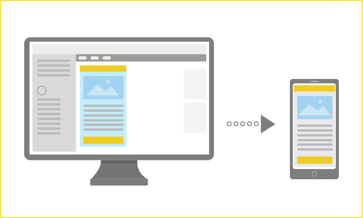
In scalable email designs, there is a simple layout that is scalable for different devices, irrespective of the screen sizes. It generally has an engaging copy with tappable and clearly visible call-to-action buttons.
If you are struggling with responsive email designs, you can use this layout or simply get in touch with experts at Email Uplers.
2. Fluid Email Design
Fluid email designs are created by percentage-based sizing. The width of the tables and images get automatically adjusted according to the screen size of the devices.
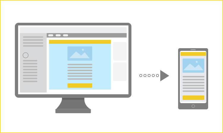
In case you are not comfortable with padding around the email (the dotted line shown in the image below), you should use this type of design.
Wrapping Up
To sum it up, responsive emails take that extra effort of adding CSS media queries that churn out two email designs according to the screen size of the device. These media queries will automatically adjust all the email elements to fit in the screen.
Although you have to go the extra mile to create responsive emails, it is all worth the engagement and unmatched results that you get.
There’s a lot that goes into creating responsive emails. In case you have any such requirements, you can bank on Email Uplers.
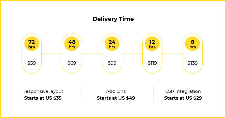
We will offer you an email with a responsive layout at a nominal additional cost of $29.


Kevin George
Latest posts by Kevin George (see all)
Banner Ad Creation: A Resource-Intensive Task Best Outsourced To The Professionals
The Complexities of Email Automation Workflows and How an Expert Can Help