Before embarking on the campaign trail with your email marketing list, it is essential for you to decide whether your customers will be using single opt-in emails or double opt-in emails list. However, that requires one to understand all the aspects related to single & double opt-in email.
According to a report by Email Marketing Benchmark, 61% of senders use single opt-in subscription list. In fact, 94% of top 100 UK email marketers use single-opt for signup.
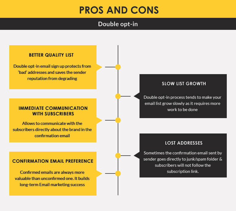
On the other hand, for double opt-in where the user provides a final confirmation before he/she starts receiving various emails; 39% of users are found to prefer confirmed opt-in subscriber list. Let’s check into some interesting facts on the pros and cons of Single opt-in and Double opt-in email marketing:
PROS and CONS of opt-in emails marketing
Single opt-in

Double opt-in
How to Double the Email Opt-in Conversion Rate?
Considering the average attention ratio is just less than 5 seconds, you really have very limited time to convince your visitors to provide their email address for subscription. Both logical and emotional aspects must be focused on for capturing the visitor’s attention. Let’s look how you can accomplish that:
1) Focus on design elements
The key design elements that fall under this category are:
• Attention ratio
Don’t keep too many elements in the email layout that demand attention from your user, as that would leave the user baffled before he/she makes it to the final subscription button. In the image below, there are too many elements calling for user’s attention – making it a bit tedious for the user to directly jump to the CTA.
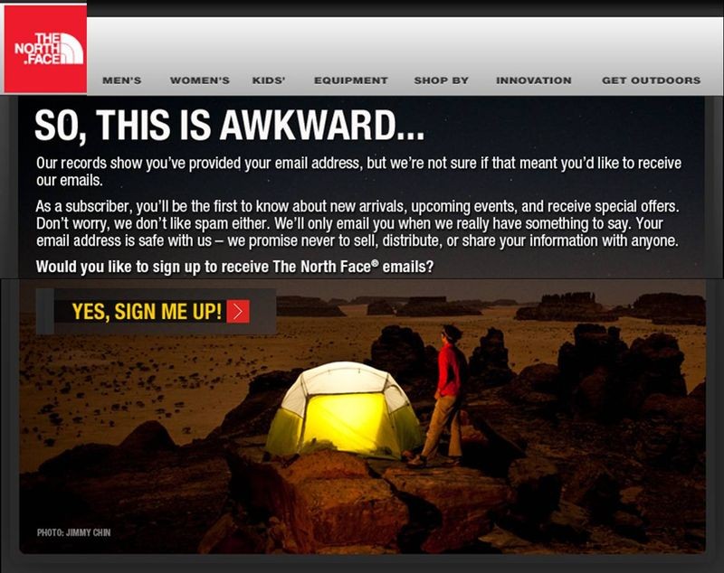
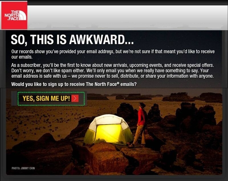
Rather than this, The North.Face could only focus on the prime “Yes, Sign me up!” feature to let the user get directly started with the subscription emails.
• Use apt images
Preferably use relevant and enticing images in opt-in emails page rather than overusing it just to make it look cheesy or glittery.
• Target for successful headlines
The tagline of your subscription email must comprise of all the information related to the product or services you offer or will be offering. In short, it should certainly STAND OUT from the rest and compel the particular user to take final action.
2) For higher opt-ins highlight compelling products
There are increased chances of getting the email conversion rate doubled by highlighting the benefits to the subscriber. All you need to drive conversion rates is to make the featured product or services actionable and highlighted.
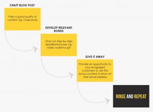
3) Apply the Grocery store formula
The formula is so named as it offers the methodology of giving out free samples to people. The LeadPages team implemented the Grocery store formula and earned 10% increase in the subscriber rate within a span of 30 days.
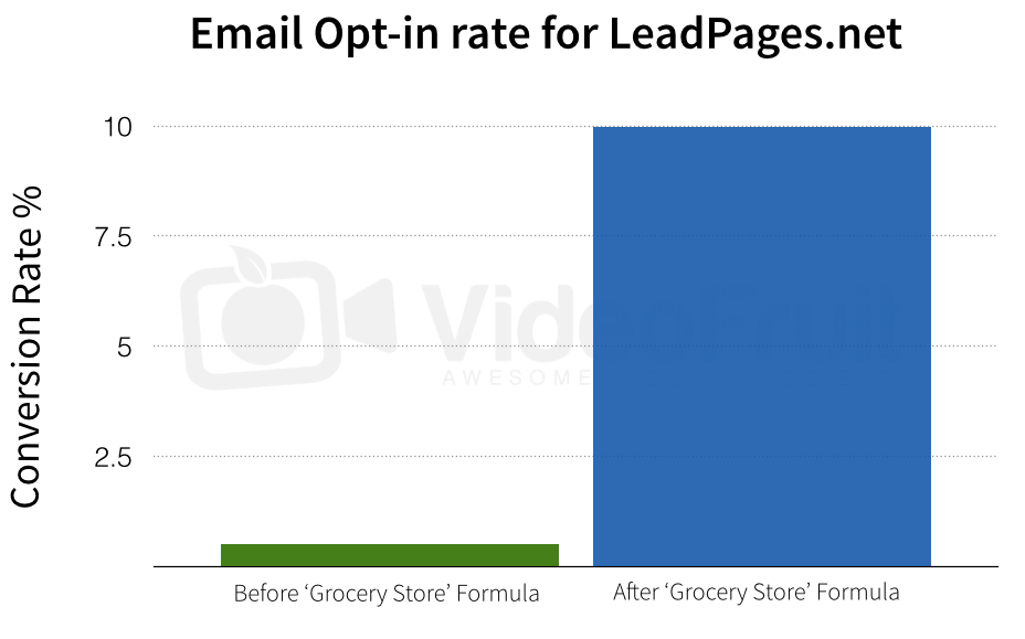
The Grocery Store formula goes something like this:
Case studies
1) Hewlett-Packard Email opt-in page conversion rate increased by 186%
HP’s registration form was a mess of confusing fields that required the visitors to scroll many times in order to finish it. To amend this, HP first identified the target audience; wherein, rather than having a lengthy form of 15 fields, the company traversed to few simple fields to gather information about the user.
Thereafter, the Company switched their focus to selected form field, wherein the team working on the email marketing metrics decided to pay proper attention to form fields like First name, Last name, Email address, Company name, and Subscription selections – lastly designing an entirely new email opt-in form page that focused on being faster & shorter.
Result:
While the page previously had conversion rate of 14%. But later on with the amendments made, it acquired a conversion rate of 40% i.e. an increase of 186%.
2) How Motley Fool thrived by converting their double Opt-in to Single Opt-in
Motley Fool was unhappy by being stuck at email opt-in rate of 60%. They in fact were failing to market 40 out of 100 people. After a much required debate, the team decided to strategically switch from double opt-in in email marketing to single opt-in in email marketing.
To get started with the process, A/B Testing was recommended. The team sent a report to 2 separate files of 35,000 recipients. The people who were into double-opt in email received confirmation email for becoming the member while the ones who went for single opt-in emails received a plain welcome message followed by subscription offer after 30 days. This led the team to understand, that by opting for single opt-in it would be certainly improving its business ROI.
However, the team knew that with single opt-in it will be getting a pool of bad addresses in opt-in email lists. Hence, it designed a much needed sophisticated system to clean out the invalid addresses. Thereafter, it established the feedback loops with the ESPs which offered them. This helped the team get the complaint rate reports for getting acknowledged about the recipients who opted for “This is Spam” button.
Result:
• Motley Fool’s subscribers were up by 45% compared to the double opt-in in past.
• The overall sales got a significant hike.
Takeaway:
Weigh your business goals & choose the opt-in according to it.
Implement Grocery Store formula to know what allures users.
Use apt images and features to let users get subscribed easily.
Well, after advocating about both single opt-in and double opt-in email marketing; Uplers advise you to choose either of them depending upon your business strategy. Here, it never has to be one size fits all.
We are really interested to know, what email opt-in you have adopted, and how it is helping you? Perhaps, you can be part of our next featured case study!




Kevin George
Latest posts by Kevin George (see all)
Top Pixel-Art in Email Design Inspirations of all time
Animated GIF in Email: Rejuvenate Your Marketing Strategy