The Black Friday-Cyber Monday weekend is no longer only North America’s biggest selling season but, increasingly, the rest of the world’s as well.
Shopaholics and not-so-holics alike enjoy the sales weekend since it enables them to grab their favorite products at low prices. And marketers do their damndest to convert more and more customers into the BFCM faith.
Did you know that in 2022, e-commerce merchants sent approximately 2 billion promotional emails in November alone? The number of such emails sent during the ten-day sales period, popularly known as Cyber 10, stood at 820 million last year.
In fact, the year recorded the five highest send days of the month during the Black Friday-Cyber Monday weekend.
Evidently, this is only going to get crazier. What any email marketer should aim to do is ‘own the inbox’ during the BFCM weekend— and nothing less! But how do you do that? You can create the most amazing Black Friday email and still go unnoticed.
We have curated our favorite BFCM emails from brands that did it right. We simultaneously touch on the strategic ins and outs of inbox-owning that these brands were mindful of during the hottest weekend of the year. Ahem! Let’s go.
Adobe Creative Cloud
Our first Black Friday email template is from Adobe Creative Cloud. The striking feature of this email is the headline, which reads: ‘We’re not talking days. We’re talking hours.’
The message creates a sense of urgency without seeming too desperate. There are no exclamation points anywhere. The content is clear, concise, and relevant. Because the headline is a spot-on attention-getter, the sub-heading is standard, if not ordinary, fuss-less, and to the point. So, full marks to Adobe’s Black Friday email template.
Note also that the CTA copy does not intend to falsely adrenalize the customer by resorting to hackneyed words and phrases.
Nokia
The number of views of e-commerce stores increases during Black Friday since more people are scouting for products on the websites of their favorite brands.
Images make a positive impact on buyers. This is why you need to showcase your products, along with their most winning features, in your Black Friday email. This is exactly what Nokia does in the following Black Friday template.
A showcase is more advantageous than a single product because the latter requires an extra click from the customer. Any product display will have individual CTA buttons, allowing the customer to go to the purchase page in one click.
Whereas a single product only acts as a nudge to view more such items on the website.
Pretty Little Thing
Maintaining brand identity across multiple channels is important. It ensures consistency in the viewing experience, as well as reinforcing a customer’s emotional attachment to the brand. To that end, our next Black Friday email template is from Pretty Little Thing.
Pretty Little Thing’s brand palette is dominated by floral lavender. Other colors include topaz, very light tangelo, Crayola’s violet blue, and Aero. This Black Friday email example turns the spotlight on floral lavender, which also figures on their website.
The Barbie-inspired fonts also align with the brand’s on-fleek, stylish products. The email breathes delicate feminine chutzpah— in tune again with the brand’s inimitable charm.
Casper
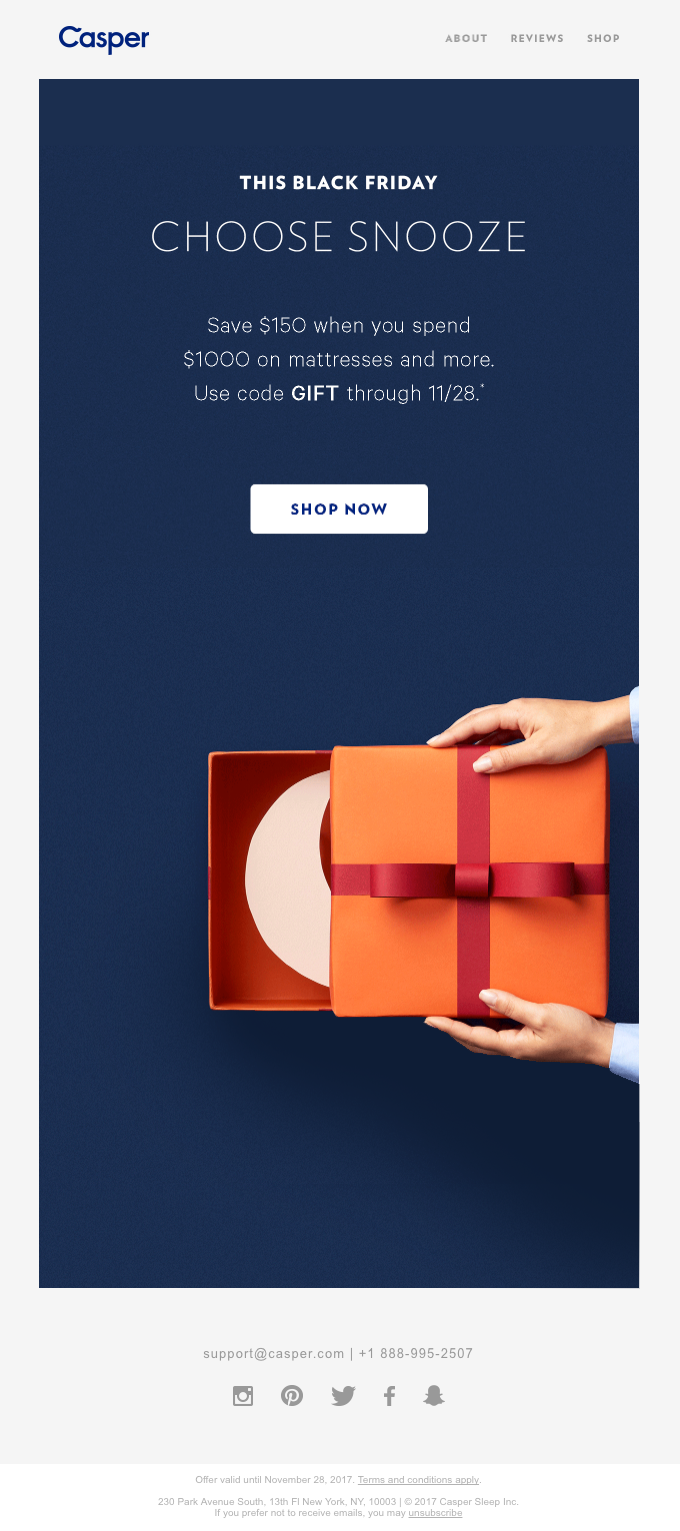
To ‘own the inbox’ basically means to stand out. There are various ways to do that. Our next example shows Casper owning the inbox through their subject line and their minimalist email design.
First, the design: it is rare that Black Friday email marketing, dependent as it is on announcing discounts and offers, should yet be able to cut it without cluttering up the emails with numerous discounts. But Casper does it with ease and finesse. Nice color contrast, minimal text, unfussy CTA — it wins as easily as it shows.
And the subject line? ‘Every Friday is Black Friday when your eyes are closed. Because you’re napping.’ The first five words are enough to freeze the scrolling.
Incase
Continuing on the same note, consider making your Black Friday emails easy to navigate by not focusing exclusively on discounts. This is because you are not adding value to the viewing experience by showing what your customer expects to see anyway.
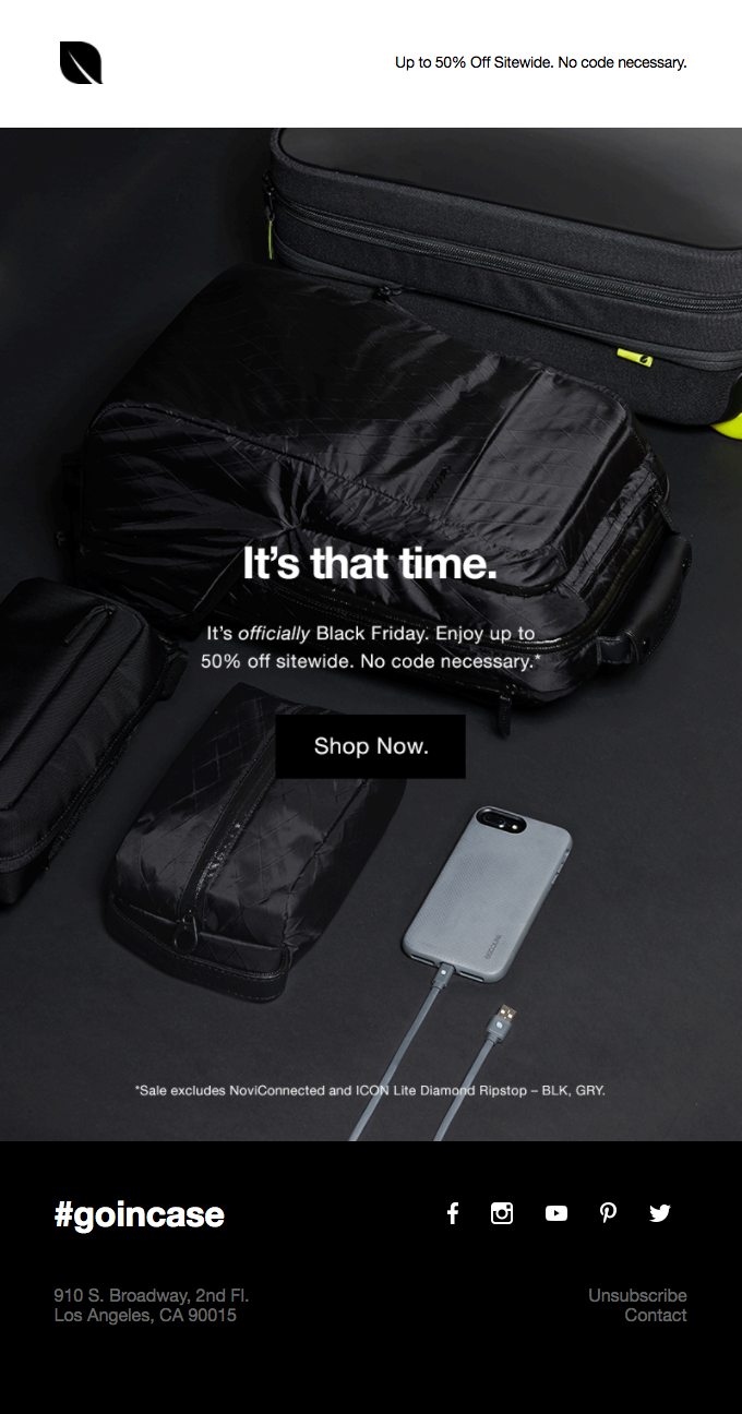
Prioritize instead the hook, the design of your email, and the CTA button. That’s what our next Black Friday email example from Incase illustrates.
Black is the staple color of almost every Black Friday email. However, that’s not the reason behind Incase’s inclusion of black in their holiday email. Black and gray are the brand colors of Incase. The email design is consistent with their website as well as their brand image.
ReadyMag
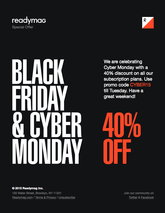
Many email marketers combine Cyber Monday and Black Friday email marketing. In such cases, your email sequence will have both Cyber Monday and Black Friday promotions. ReadyMag’s BFCM email is a perfect illustration of the same.
Usually, most brands use at least two separate fonts for large headers and small texts. ReadyMag, however, uses sans serif for the entire email, ensuring readability across all devices.
The template is simple yet sober. The pale orange is also consistent with their website’s color scheme.
Udemy
There are various ways to employ psychological triggers in order to make your customers act more quickly. No doubt they come in handy during the BFCM weekend.
Hence, our choice of Udemy’s Cyber Monday template that features a countdown timer.
Including a countdown timer in a promotional email is a stroke of genius, never mind the tactic’s (seeming?) overuse by now. Instincts do not wear out so easily, so you can still make use of timers in your Cyber Monday/Black Friday email campaigns.
The timer plays on loss aversion and the fear of missing out (FOMO), prompting your customer to decide and act quickly.
Standard & Strange
E-commerce companies say that email gamification leads to a 15% increase in average email checks compared to traditional emails.
Gamifying your BFCM emails is a great way to engage your customers in order to trigger sales. Standard&Strange’s ASCII-coded, gamified email truly hits the mother lode.
This brings us to what we may call a subtle digression tactic used in a promotional email.
This means that the email creates an immersive experience so that the subscriber transcends the immediate Cyber Monday context for a while, which sharpens their focus on the main subject of the email when it comes to the fore again.
This is something Taco Bell does more directly in their Cyber Monday template – our final example in this post.
Taco Bell
As you can see, Taco Bell has one of the quirkiest email headlines. This is a winning move on their part, if only for its rarity. The subscriber is immediately directed to the featured item on the menu.
Had they done it in the usual way, i.e., by announcing their featured item on Cyber Monday, it may not have been that impactful, no matter if the message was still successful in terms of sales. The secondary motive of the headline is to induce a sense of relief, thereby standing out from the other brands in the customer’s inbox, which is the primary motive.
As far as the design is concerned, the email seems cluttered at first glance (owing perhaps to the moderate use of negative space), but it is actually not. The slanted heading enhances scannability, allowing for a quick reading.
In Lieu Of A Conclusion – A Note On Responsive Design
Applying the above Cyber Monday/Black Friday email marketing ideas successfully requires that your emails open on multiple devices seamlessly. Here are five quick HTML coding tips to help you design responsive emails.
1. Use inline CSS since many email clients tend to view external CSS as a threat and block the link.
2. Start by designing for mobile devices and gradually enhance the design for larger screens with the help of media queries.
3. Choose tables to create consistent layouts since most email clients support tables.
4. Set the ‘max-width’ property to ensure your images scale down on smaller devices.
5. Aggressively test your email on different email clients.


Susmit Panda
Latest posts by Susmit Panda (see all)
A Microscopic View: The Ins And Outs Of HubSpot List Segmentation
Give Thanks in Style by Making These 8 Thanksgiving Email Inspirations Your Guide!