Come the months of July, August & and September, most of us wait for our owls to swoop in from that living room window that we leave slightly ajar, hoping against hopes that we will be declared a wizard and offered a seat in the Hogwarts School of Witchcraft and Wizardry.
While we may or may not (hope is all we have!) get that list of things to buy from Diagon Alley for the coming term, many learners across the tristate area will be re-joining term pretty soon! This brings us to a golden segment for marketers and brand owners alike. You guessed it right, ladies and gentlemen; we are indeed referring to the extremely popular and revenue-generating “Back To School” email segment.
Even if your brand is not directly associated with the educational sector, you CAN capitalize on the potential of this segment; leaving it untapped is akin to leaving easy money on the table. Wouldn’t wanna do that? Then stay tuned, people!
Ten Back To School Email Inspirations That Are Absolute Gold
1. Techilicious Supersaver Back-to-School Email by The US Tech Firm Plug
Let’s face it, today’s kids and young adults (college sophomores) need the latest tech goodies and gizmos to lead and stay ahead of the pack. Being technologically savvy and well-equipped with the best-in-class gadgets is definitely an add-on and something parents and students look to stock up on before resuming school or uni.
This email by Plug, with its easy-on-the-eye single-column layout, capitalizes on the same need with panache! They offer sweet deals at never before prices, and look at that blinking ticker tape like the “New Deals Everyday!” signboard right on top! They are acing the back-to-school game with crisp CTAs and some seriously cool bundle offers.
Plus, they know that shopping for students can get expensive; therefore, they have introduced the “save USD 20” feature that is bound to appeal to anyone shelling out for tech supplies for their kid or for themselves. Way to go, Plug!
2 Back to School Faves Served With A Tinge Of Pastel Aesthetics & All-Things-Cool!
With the excitement of meeting new mentors and old friends, there is a palpable love for stocking up on brand-new lunch packs, rucksacks, and other cool accessories. Bohemian Mama slays with a back-to-school email that displays their awe-inspiring collection in a neat, well-segmented design with a distinctly hippie vibe. The cleverly placed CTAs and the option to shop for different segments, or maybe all of it, takes the cake. We also love the pastel vibe here!
3. Free Shipping, The Spirit of Giving Back & Sharing Customer Stories!
No one likes to saunter into a fresh school year with last year’s grub! Simple Modern’s back-to-school email on point marketing truly delivers. With free shipping on orders above USD 50, one gets the push to start loading up on the awesome goods on offer.
The hero image of happy kids and happier parents (because hey! They saved a couple of dollars on shipping!), product collections, CTAs, and of course, the invitation to share user stories is definitely an add-on.
4. Free Shipping, Crazy Sitewide Discounts & Neat Aesthetics ~ Could they be any neater?!
One look at the email, and you fall in love… with the memories of your childhood all over again! The happy kiddo next to the chalk outline of a friendly dino is reminiscent of innocence, carefree days, and lounging in the Sun on fresh, green grass. The Z layout of the products and their descriptions is easy to read and analyze.
The 60% sitewide discount is a very sweet deal and should register into good conversions because who doesn’t like to fall for great deals from awesome brands? Their top school pick of essentials (both fresh additions & bestsellers) for the year is a total winner.
The neat smattering of CTAs towards the end is a fitting end to a simple yet effective email that will tug on the heartstrings of children and parents alike! In the latter’s case, their purse strings too! 😉
5. College Essentials at Throwaway Prices With Coupon Codes & Free Shipping (we spotted an asterisk there, so T&C apply!)
Psst… did we mention they offer an overtime payment option with Klarna?! What more could a perennially broke college student ask for? With those education loans not getting any cheaper, this considerate gesture by Shop Premium Outlets is surely winning many young hearts!
With an eye-opener for a subject line in the upper fold of the email design that makes you blink twice, these peeps know what they are doing. If your target segment is the college student, then this is how one could consider doing it.
6. Summer Clearance Discounts, Happy Cherubs & Going Beyond The Usual
What better way to announce new products than to line them up with a segment when parents and students would already be looking to splurge?! Want to make the deal extra irresistible for those at the viewing end? Offer them a 75% discount on the summer items, and chances are high that you will be busy counting cash sooner than we can say YEAH!
Everything about this email from Hanna Anderson screams perfection. Right from the on-point visual hierarchy to the graphics (happy kids playing there we go around the mulberry bush) and the sheer value in terms of the money invested and the quality of the products that, as they say, will go “beyond” till the last day. We ain’t complaining, people!!!
7. Offering Something for Everyone With the Power of Compellingly Quirky Copy
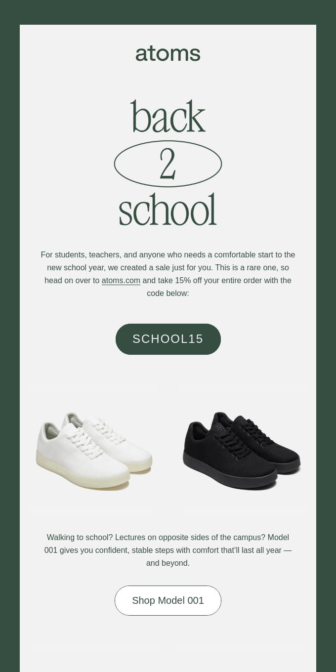
The dichromatic interplay of two stark extremities, the single column layout and the subtle shades of grey, paint the canvas for marketing excellence with compelling copy and creative coupon-coded discounts. This one emphasizes the preemptive comfort offered by their product to every wearer, whether they are a student or a professor running across the campus trying to make it to a lecture on time. Well done, team!
8. Adding Value Through Giving Just A Little More With An Element of FOMO & Free Shipping (well, almost!)
Papyrophiliacs, get ready to fight back the urge to order beautiful journals. On second thoughts, don’t! Because of the way this email has been executed and designed ergonomically by the team at Compendium, everyone who puts pen to paper at some time during the day will find it hard not to place a bulk order! Four for the price of three, informative blogs towards the end, and free shipping for orders above USD 50, they have really hit the bullseye with this beauty.
9. Capitalizing On The Back-To-School Segment Even if You Don’t Lie In The Periphery Of The Education System

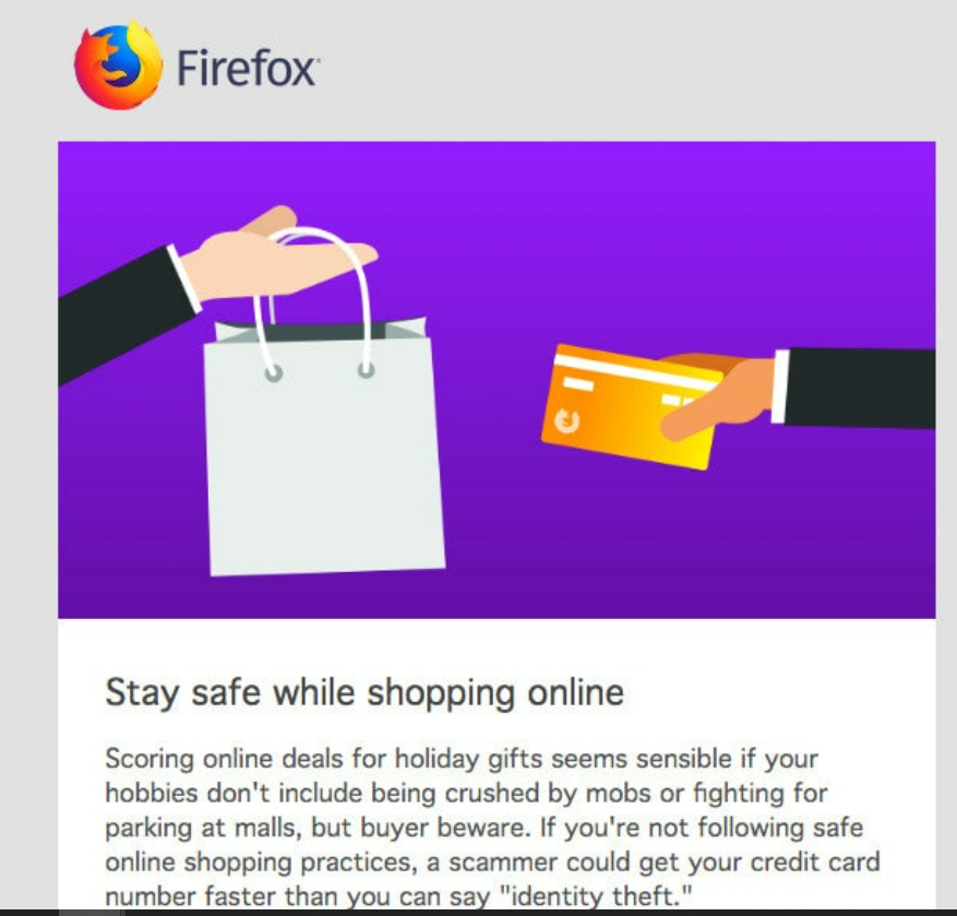
We saved the best for the last. This newsletter from Firefox (a gem from our inbox), a brand that has nothing to do with kids and students per se, emphasizes how one can turn the reigning tide in their favor. Whilst they offer value to those swiping cards virtually, this newsletter gently draws attention to the brand sentiment, that is, they care! And sometimes, that is enough to get people to check out what you have to offer. That’s how it’s done, ladies and gentlemen! Did we mention the super neat single-column design that adds the power of simplicity and elegance to the e-newsletter?
Conclusion
On that note, we hope to have inspired you enough to get cracking on superlative back-to-school emails for your brand. However, if you feel that you could do with professional help in designing and coding an amazing back-to-school email that helps you laugh your way to the bank, we at Email Uplers, would love to do that for you. Do drop by and let us know your bespoke requirements for the season and the seasons to come! Ciao!


Naina Sandhir
Latest posts by Naina Sandhir (see all)
Step By Step Guide To Successfully Integrating Salesforce CRM With Adobe Marketo
Boost Email Deliverability And Seal The Success Of Your Campaigns- A Comprehensive Guide To Email Whitelisting