For a business, publishing an ebook is a big deal. Among many things (including generating new leads and growing their mailing list), it’s their bid to assert themselves as a figure of authority within their respective domains. Naturally, they like to leave no stone unturned when it comes to the research, design, and development of the same. Every marketer and business owner reading this concurs, I’m sure. But, an ebook, no matter how matchless it is, cannot work any magic unless it reaches the eyes of its intended recipients- your subscribers. And we all know how devilishly tricky that can be.
Weeks and months of hard work gone in vain, simply because you can’t figure out how to make your readers click on that “Download” button. The primary culprit behind this? An ineffective landing page. How impactful your landing page is directly determines the success of your ebook. If you’ve struggled with this aspect in the past, you’re just at the right place. Today, we are going to dive deep into four splendid ebook landing page examples to help you understand what goes into crafting an ideal specimen.
However, our discussion won’t be simply confined to landing pages. We’ll also be analyzing the emails through which the landing pages were discovered. Excited to see what’s in store? Well, dig right in!
1. Email on Acid
Subject line: Ebook: “The omnichannel hero’s journey”
If you belong to the email community, there’s an extremely slim chance that you haven’t heard of Email on Acid, that’s just how prominent a voice they are. This reputation and visibility is not built solely on the back of their brilliant content and suite of offerings, but also the immaculate marketing strategies they employ to spread the word of the same.
Let’s take a look at how they went about promoting their latest ebook.
First, every Email on Acid subscriber received this email.
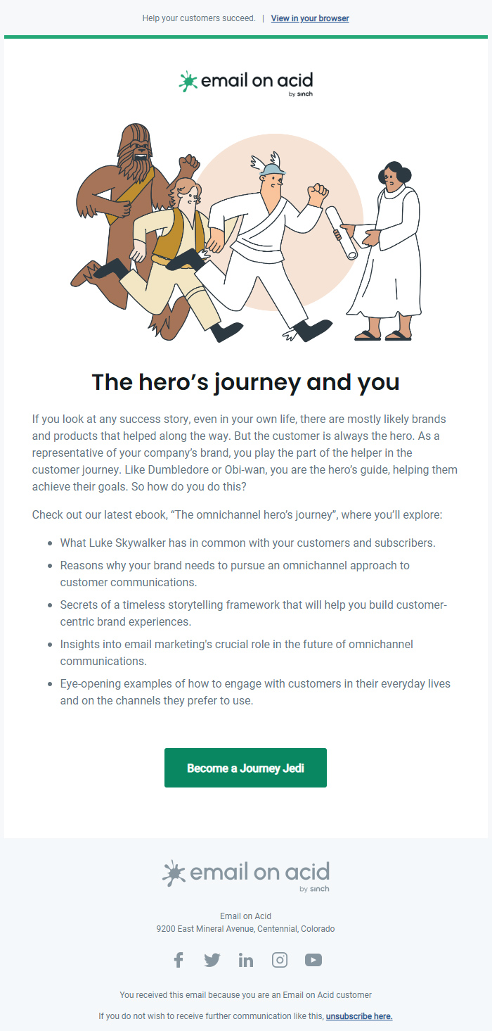
There are a multitude of reasons which make this email engaging:
- The first thing which catches your eye upon opening the email is the neat and attractive illustration- captivating and intriguing in the same beat.
- Next, you are greeted by a catchy headline; you’re invested in this email now. You proceed to read the body.
- The good work of the illustration and the headline is replicated by the email copy. Its tone is warm, conversational, and extremely friendly. What’s more, it has pop-culture references too!
Through the copy, they gently break to the reader the gist of the ebook. My favorite part about this email? The CTA (call-to-action) button! It’s crisp, definitely not run-of-the-mill, and perfectly in tune with the theme (yes, Star Wars) that defines the illustration and the copy.
Upon clicking on the CTA, you are led to this landing page.
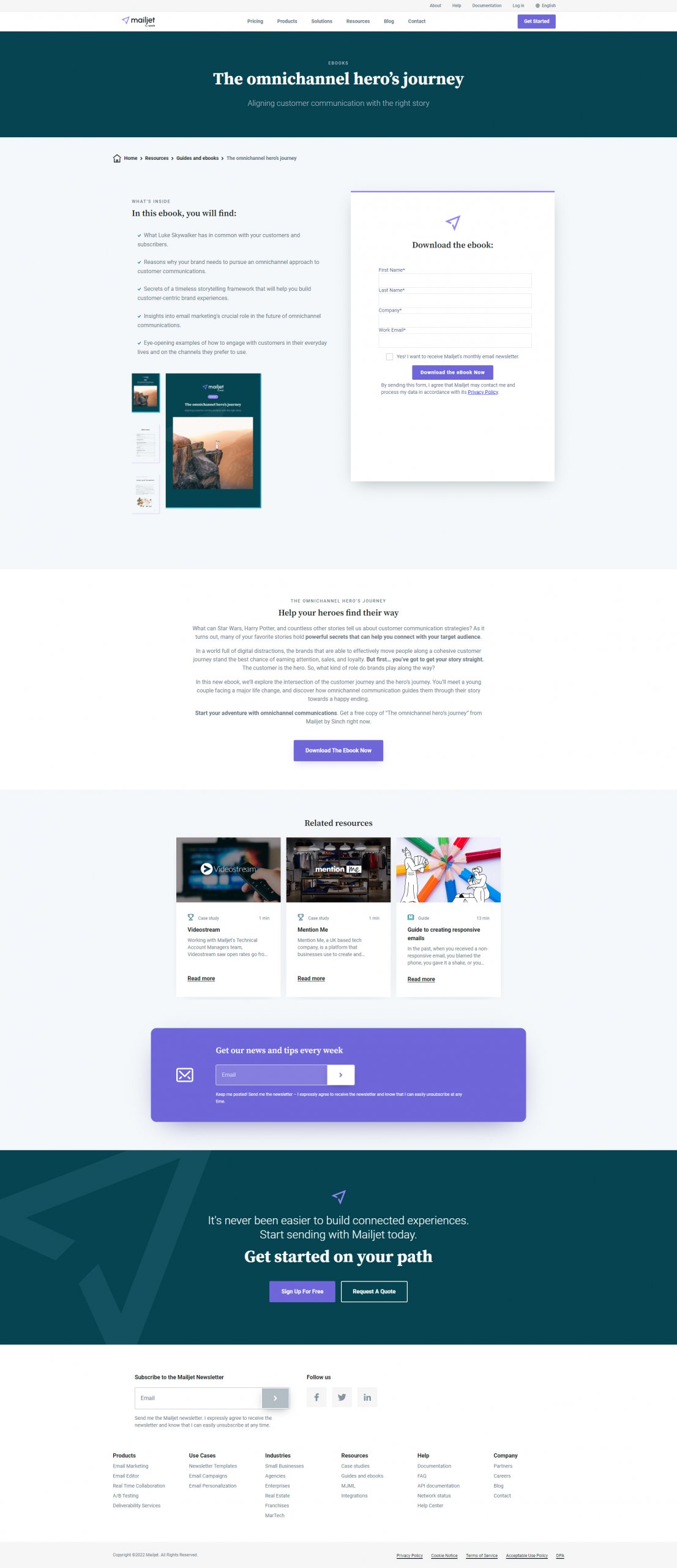
The title of the ebook serves as the heading of its landing page. A brief subheading offers additional context to the readers. On the left, you can find the ebook’s salient points, reiterated. On the right, there’s a sign-up form which visitors need to fill out in order to access the e-book. The form ticks all the right boxes too, as it has:
- Few data-entry fields (which is a golden rule while crafting sign-up forms. A form with too many fields discourages visitors to no end)
- An opt-in form for those interested in subscribing to their newsletter
- A prominent CTA
When you scroll down, you come across another summary of the ebook, different from the one presented in the email, further nudging you towards downloading the ebook.
Despite all your encouragement, there’s no absolute guarantee that you’ll be able to convince your reader. You must always keep this in mind. That said, getting them to check out the landing page from the email was no small feat either, and now that they are here, you must capitalize on their eagerness. How can you do that? By showing them previews of other related content resources, much like EoA has done over here. So what if the reader isn’t very interested in what your current ebook has to offer, maybe they will find themselves drawn to some of the topics you’ve published in the past!
2. Litmus
Subject line: Made an email mistake? You’re not alone.
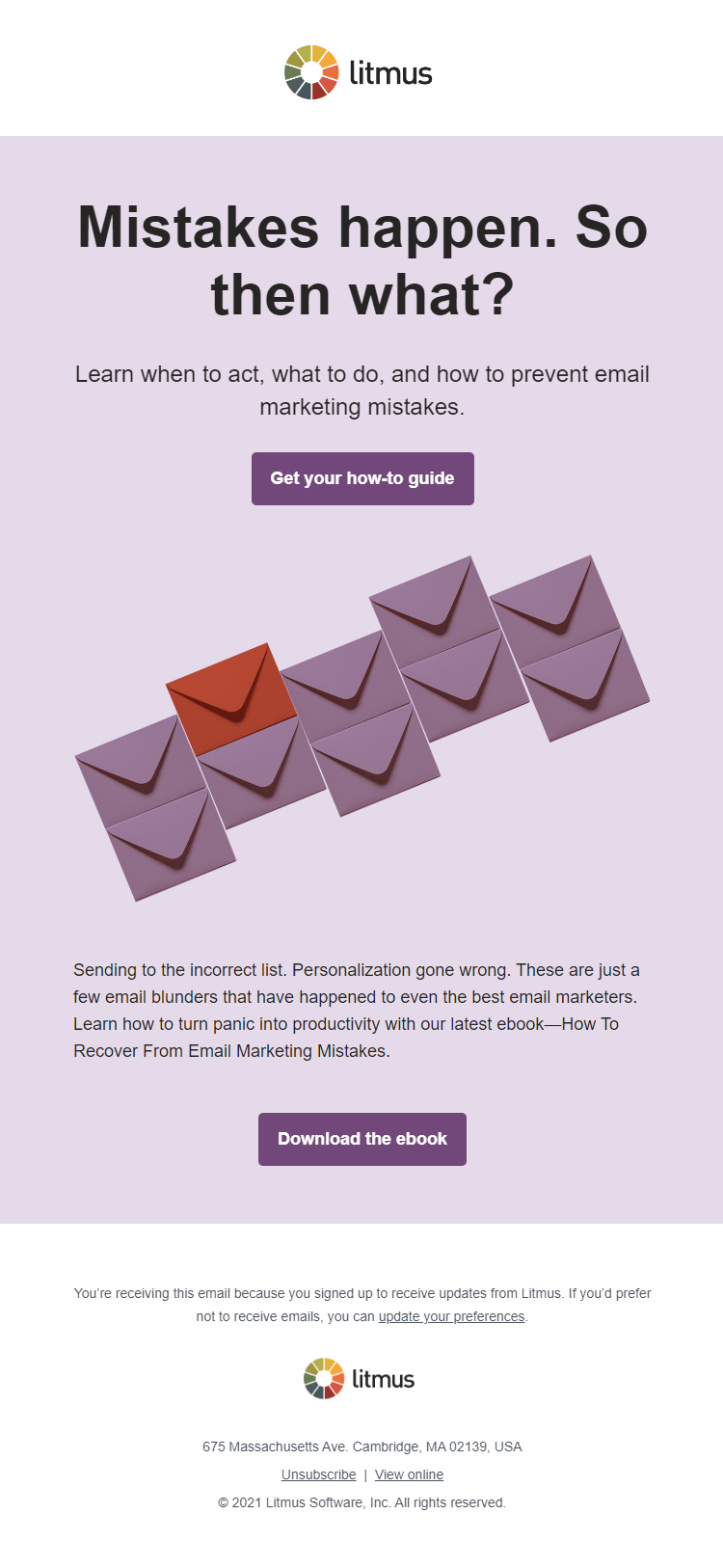
This email lets you experience the power of a good headline in its full glory. One glance at it is enough to keep you glued to this email, isn’t it? Over here, the headline is followed by a concise and effectual copy- it builds upon the idea of its predecessor and helps the reader understand the context of the email, rather unambiguously. Should you choose to scroll any further, you’ll discover a crisp summary of the ebook, followed by a CTA, prompting you to download it.
Clicking on that button will land you over here.
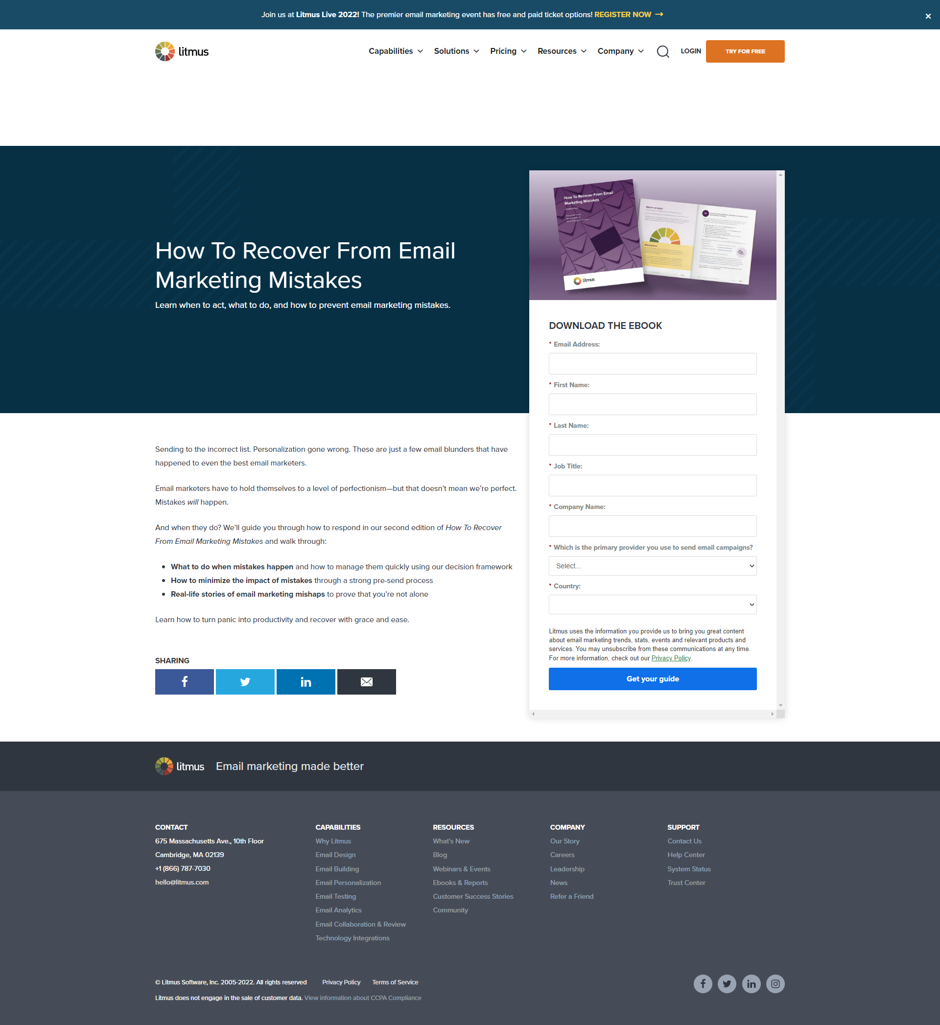
As you can see, this landing page is essentially divided into two columns- the left half gives visitors an executive summary of the ebook (observe how the key takeaways are in bold; it’s an excellent tactic to grab attention), and the right half is the signup form.
Now, I’m sure you’d have already noticed that this signup form is a lot more elaborate than the one in the previous example? So, is it just as effective? Yes, because Litmus have clearly justified the presence of additional data-entry fields in this form. They are transparent at the outset, clearly stating that they will be utilizing the user’s data to send them personalized content.
What I particularly appreciate about this ebook landing page is the social sharing buttons. Irrespective of which type of content you’re putting out, it is always a good practice to enable your readers to share the same across their social handles. It’s a good way of gaining traction while also attracting news leads simultaneously.
3. Campaign Monitor
Subject line: A Marketer’s Guide to Enterprise Email Marketing Platforms
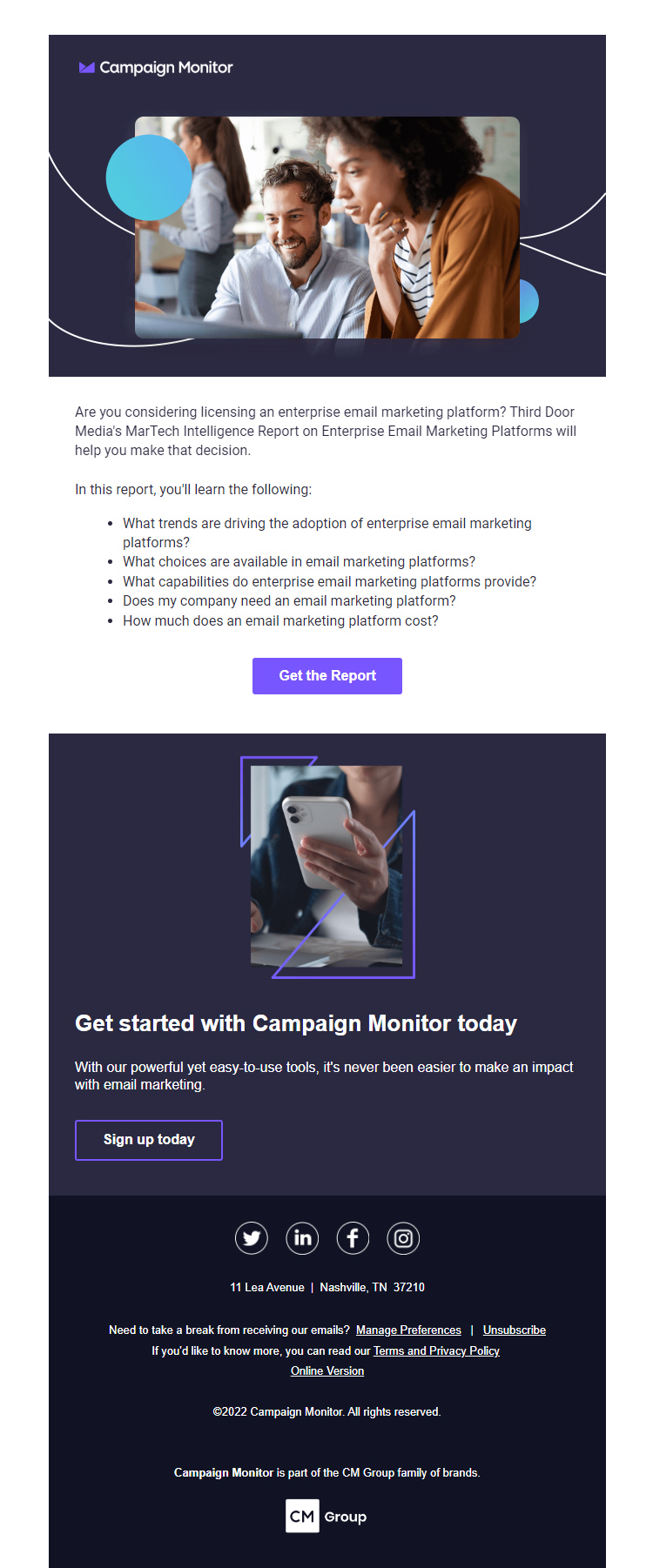
If you are ever planning on using stock images in your email, you need to take three things into account:
- It should be of high quality
- It should be relevant to the copy
- It should be optimized to prevent the email file size from going overboard
Or, you could just pin this email by Campaign Monitor over here for they have perfectly executed the points mentioned above. As per the copy, the framing and the tone isn’t largely different from the rest of the examples in this list.
However, what got my attention was this one unique touch they have added- instead of listing out the central themes of the ebook in bullet points, they have compiled a list of questions that are most likely to rent the reader’s mind with respect to their ebook’s topic. All of a sudden, in your mind, it’s not just another ebook, but a literal answer to all of your questions and problems! You wouldn’t think twice before downloading such a resource, would you?
Now, onto the landing page.
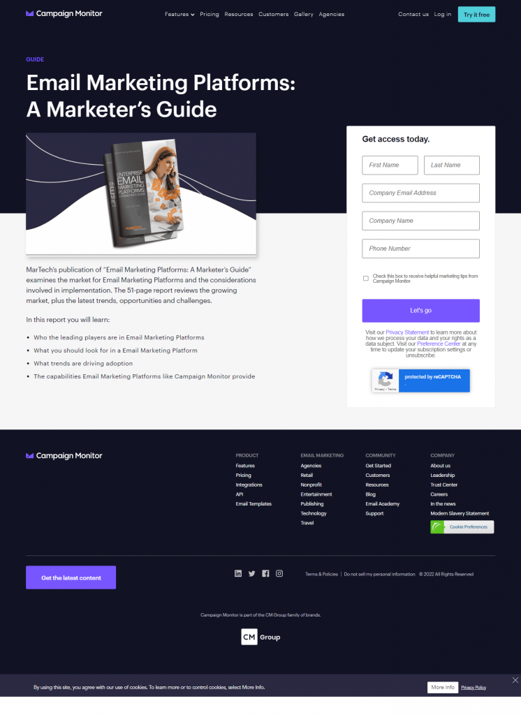
Two things about this landing page stand out for me:
- The top of the page contains a visual representation of the ebook. Although the ebook is, basically, a virtual entity, lending a tangible form to it is a rather smart way of encouraging visitors to download it.
- They have mentioned the exact page count of their ebook- it might come across as a trivial detail, but the length of a content resource does play a big role in shaping a reader’s perception. Everyone has different reading appetites- some find solace in poring through 600-800 page long dramas, while others seek respite in byte-sized short stories. Thus, providing transparency regarding the length of the ebook right from the beginning is a pretty great move, in my opinion.
4. Stripo
Subject line: AMP Geeks. Are You Ready to Build Your New Game?🎲
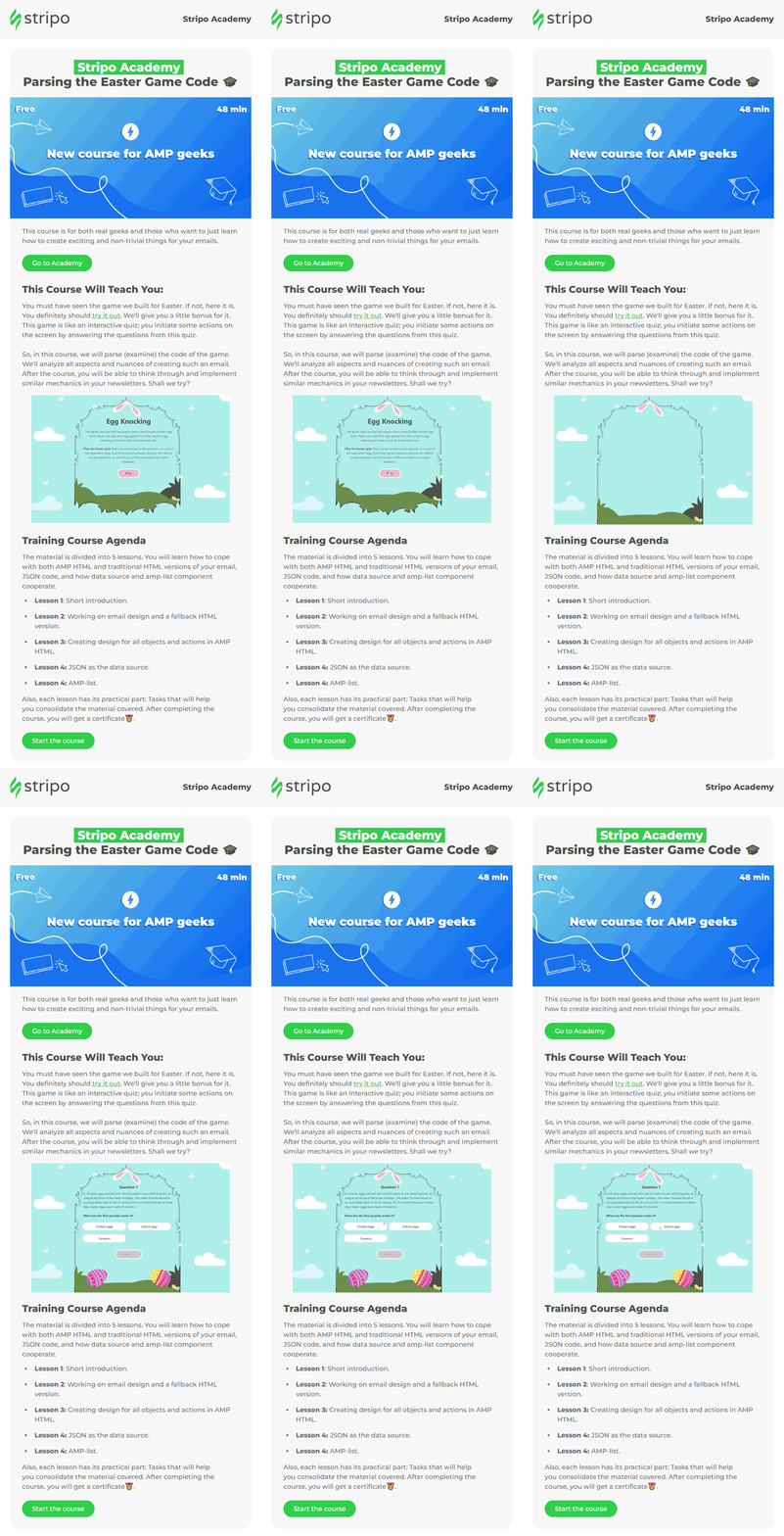
While text-intensive, the email has been punctuated with visual elements at regular intervals to keep it from looking cluttered. What makes this email really persuasive is the inclusion of a proof of concept in it- Stripo don’t just simply go on and on about the learning outcomes of their course, they incentivize prospective candidates by offering a small demo (yes, the GIF) of what one will be able to achieve by the end of this course.
Clicking on the CTA will lead you to this landing page.
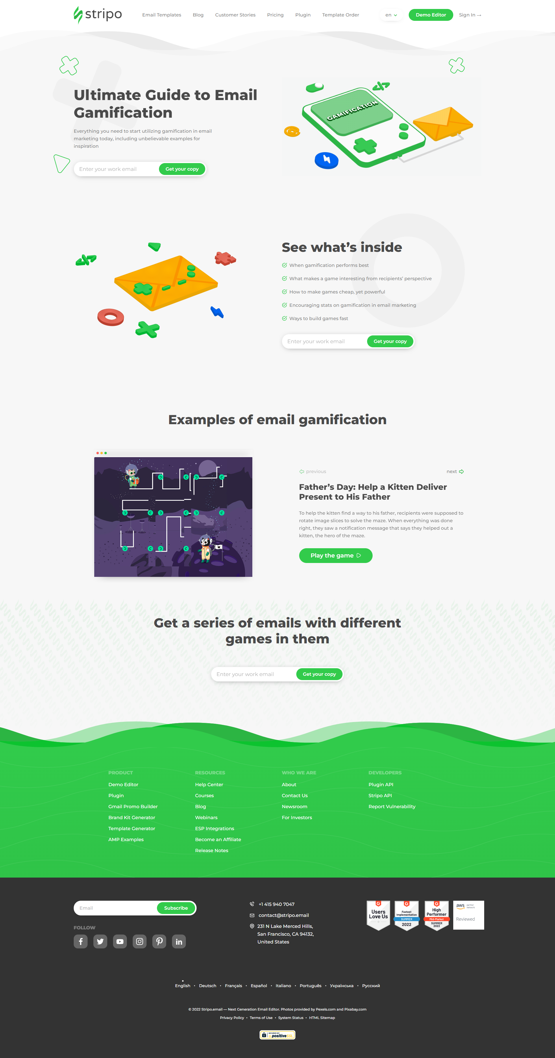
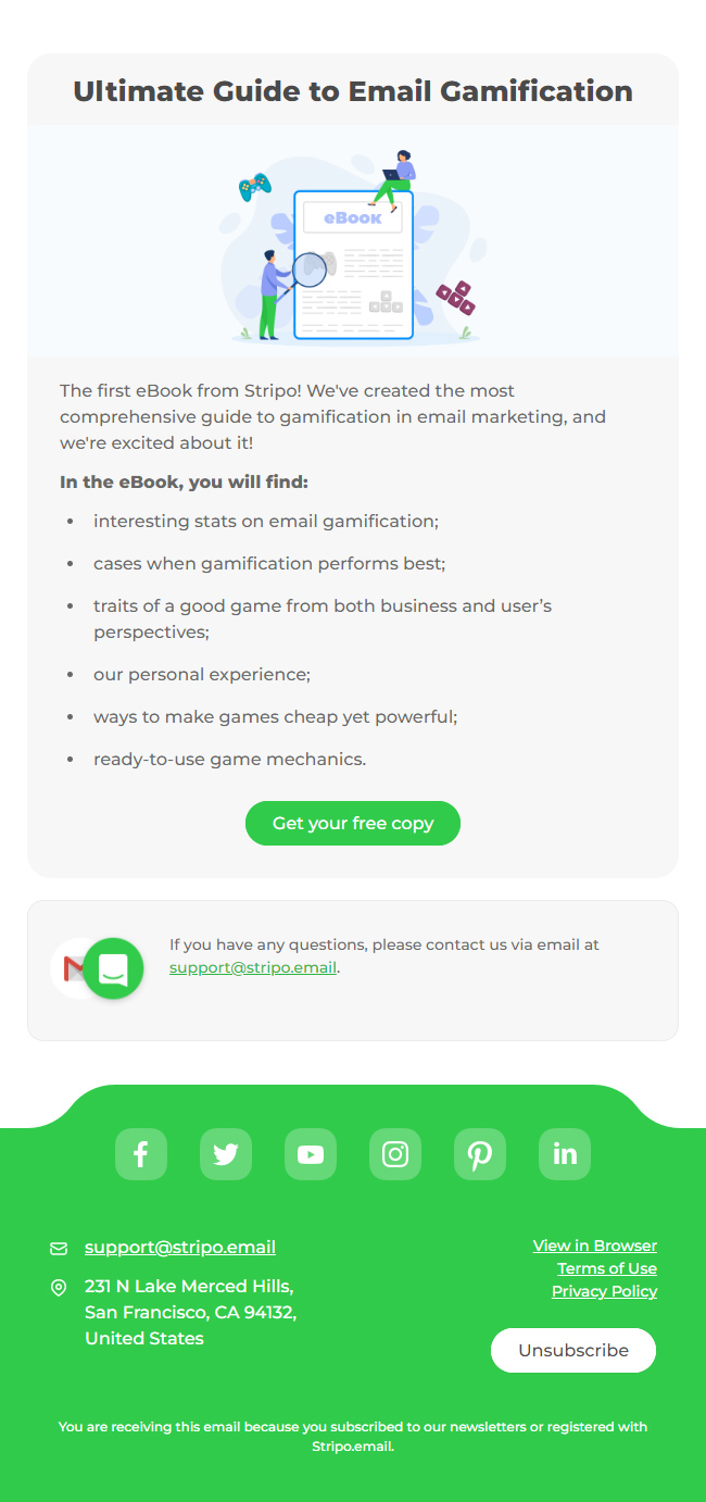
This landing page is extremely pleasing to look at- besides being minimalistic, the visual cues are right on point. They, on their own, sufficiently convey the landing page’s context to the visitors. Here, Stripo has made it quite convenient for visitors to obtain the resource; all they have to do is provide their work email.
The landing page copy is succinct and to-the-point, piquing their curiosity by revealing the ebook’s core themes. To cap things off, the landing page also directs visitors to reading material for greater clarity. All in all, it has all the trappings to beget a entry into the landing page hall of fame.
Wrapping It Up
Your notebooks must be full from all the insights these stunning examples had to offer, right? But, the exciting part begins now- putting them into action! I hope that the landing pages you will create henceforth will have no trouble fetching you the downloads you desire.
Need help with designing and coding landing pages that engage and convert? Email Uplers can help.


Rohan Kar
Latest posts by Rohan Kar (see all)
Outlook Signatures: Everything You Need to Know
Best Practices for Creating HTML Email Links With Advantages and Disadvantages