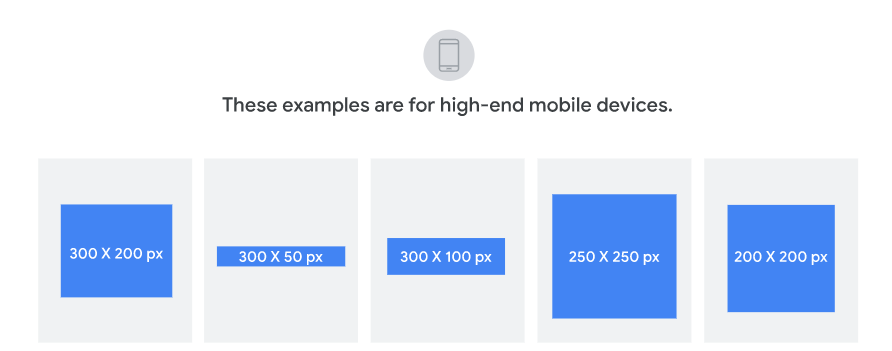
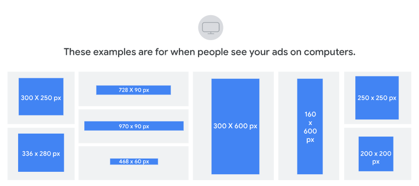
Today, we are setting foot in the often-misinterpreted realm of responsive banner ads. And if you have been throwing pixels in the digital void and crossing your fingers to get objective-fulfilling results from your ad campaigns, it is time to evolve.
But let’s be honest here. Banner ads do not always come with the best reputation. They remind me of that uninvited friend who crashes every party and insists on being the center of attention.
But what if I told you that your responsive banner ads could actually become the center of attraction?
Well, I am just stating the obvious. Google has evolved over the last decade from text-based ads to image-based ads. In late 2019, Google announced its major shift to responsive ads for its Google Display Network(GDN).
So, in this article, we have curated tips on what to do and what not to do to increase your banner ad target audience’s hunger for more.
Let’s get to work!
What is a Responsive Banner Ad?
A responsive banner ad is a flexible and adaptable ad that changes its size depending on the device’s screen size. Marketers have found flexible banner advertisements particularly useful as the number of people using mobile devices to access the web continues to rise. Ads that can stretch and reformat themselves to match any screen size provide a better user experience and higher engagement rates.
Responsive display ads edge dynamic ads in terms of managing assets. In responsive display ads, Google processes and creates combinations of responsive ads basis your inputs of assets.
The assets of these responsive banners in Google ads are:
- Images: up to 15 high-quality marketing images
- Logos: up to 5 different logos with the aspect ratio of either 1:1 or 4:1 or both(recommended)
- Descriptions: up to 5 different descriptions of 90 characters each l
- Headlines: up to 5 different headlines of 30 characters each
- Long Headline: a 90-character long headline describing the value proposition of your business
- Add a feed for dynamic remarketing: link your campaign to a feed to offer quality product information. Learn more.
- About performance labels: after serving responsive banner ads for a long tenure to store statistically significant data, each asset will have a performance label indicating which ones have performed best and which haven’t. You can make substantial adjustments to those which haven’t to generate more effective results.
What are the Benefits of Using Responsive Banner Ads?
You can optimize your ads: Responsive banner ads let you tailor your adverts to any display size, increasing the chances that your message will be seen and understood by as many people as possible.
It offers a broader reach: Reach a wide set of audiences with responsive banners. In addition, Google ads allow you to target users across a more comprehensive range of devices and applications of web-based services like chat, email, e-banking, e-shopping, video conferencing, etc.
You can use them with videos: Videos spark an audience’s interest, maximize your reach, and lead to more conversions.
It will save you time: With adaptable banner advertisements, you only need to make a single ad, which will look great on all devices, saving you time and money. You won’t have to manage ad portfolios within ad groups and campaigns.
You can use them with feeds: Feeds can incorporate responsive banner ads to ensure they are always up-to-date without requiring a complete redesign.
Now, let us narrow down the best practices you must follow to get maximum benefits from your responsive banner ads.
What To Do: Best Practices of Responsive Banner Ads
Keep it Simple
Using a clear and concise message emphasizes the benefits of your product or service. Keeping your advertisement straightforward will increase the likelihood that it will be read and remembered favorably by its intended audience.
Use Responsive Layout/Design
If you want your ad to look good and perform exceptionally across multiple devices, create responsive banners keeping the design, layout, and image sizes in mind—a responsive design results in a better user experience, higher engagement, and more conversions.
Create a Mobile-First Design
Since most people use mobile devices to access the internet, mobile-first design is essential when developing responsive banner ads. Therefore, your ad needs optimization for mobile viewing, including features like touch controls and vertical scrolling.
Use Clear and Compelling Calls-to-Action
Your call to action (CTA) must be visible, unambiguous, and relevant to your ad’s purpose. Refrain from bombarding the ad with too many of them. Instead, make your call to action (CTA) the focal point of the advertisement by using language that encourages readers to take action.
Optimize for Loading Speed
Ads that take more time to load can decrease engagement and cause a negative user experience. That’s why you need responsive html5 banner ads. For example, you can improve your advertisement’s loading time by compressing its code and files, using optimized images and graphics, and reducing the number of complex animations used.
Test and Refine
A good, responsive banner ad is often the result of extensive testing and iteration. In addition, Analytics tools will help you monitor ad iterations by testing new headlines, pictures, and calls to action. Make adjustments to your ad based on the feedback you receive.
Use Subtle Animations
Subtle animations are a great way to attract the attention of your target audience and give your advertisement a more engaging visual element. While animations can add a nice touch, using them sparingly and subtly is essential to avoid distraction.
Use High-Quality Images
Responsive banner ads cannot exist without the use of high-quality images. Ensure the pictures you use align with your text and are fascinating and optimized for desktop and mobile viewing. Use high-quality photos; pixelated or low-resolution ones will only hurt your advertisement’s credibility.
What Not To Do: Harmful Practices
You have to be mindful while designing your responsive banner ads. If you lack expertise, don’t be adamant about doing it yourself. You might harm your brand’s reputation or get banned by Google for disdaining its policies. Instead, try using professional email banner design services to get responsive designs that comply with Google’s responsive display ads policies.
Take a look at the practices that you have to avoid at all costs.
Overcrowding the Ad
One common error with responsive banner advertising is packing too much information into the space available. When there is too much content in an advertisement, it might be overwhelming for the user. So keep your ad simple and clean, without too much text, too many graphics, or too many other components.
Using Small Font Size
Ads with small font sizes can be challenging to read, especially on mobile devices. As a result, user engagement and experience may suffer. So, choose a font size that works well on desktop computers and mobile devices. For example, 16 pixels is the ideal font size. Anything less than that, and the user will have to pinch and zoom to read.
Using Too Many CTAs
If your ad has too many calls to action (CTAs), it may confuse and frustrate your audience. Instead, keep your call to action (CTA) simple and direct to align with your advertisement’s overall purpose.
Inconsistency in Design
Your banner ad will look unprofessional and confusing if the design is inconsistent. Make your advertisement more visually appealing by sticking to the same color scheme, typeface, and design components throughout.
Using Low-Quality Images
Using low-quality photos can make your responsive banner ad appear unprofessional and may even reduce effectiveness. Ensure the images you pick complement your text and are suited for desktop and mobile viewing.
Sleep on Google’s Responsive Ads Policies
If you want to stay out of trouble, you should read up on Google’s policies regarding responsive ads. For example, if you wish your banner ad to be accepted, you must ensure it complies with Google’s regulations and requirements. If your ad does not follow these guidelines, it will get rejected, and your account might get suspended.
Let’s discuss this in more detail in the following subheading.
Related Policies and Reasons for Common Disapprovals
These policies are the reasons why responsive banner ads may get disapproved. So let’s wrap our heads around them.
Editorial
All advertisements must comply with the generally accepted standards of legibility, spelling, capitalization, and symbols. For more, please refer to the Editorial Policy.
Unclear relevance
Everything in the ad must be directly associated with the promoted product. All supplied ad fields, for instance, should pertain to the same advertiser and the advertised commodity. For further details, please see the policy on Unclear Relevance.
Misleading content
Everything in the ad must be valid and depict the promoted product or service. For further information, please review the policy against Misleading content.
Image quality
There is a minimum requirement for the quality of all advertising photographs. The image’s arrangement and clarity must be up to snuff for use in Google Ads. For further details, please review the policy on Image Quality.
Trademarks
In response to trademark holder complaints, Google may delete related advertising or assets. However, with their ads, assets, and company details, advertisers must exercise caution while using trademarks. For further information, read the Trademarks Policy.
Key Takeaways
- The size of a responsive banner ad automatically adjusts to fit the device’s display size.
- Responsive banners are advantageous because they improve ad performance, reach a wider audience, work well with videos, save workload, and integrate easily with feeds.
- The most effective responsive banner advertising follows best practices such as minimalism, mobile-first design, a responsive layout/design, strong calls to action, fast page loads, iterative testing and refinement, discreet animations, and high-resolution pictures.
- The ad should be easy to understand, built with responsive design, mobile-optimized, have a clear and prominent call to action, feature high-quality imagery, and be subjected to testing and refinement to achieve the best possible outcomes.
- A better user experience, increased engagement, and more conversions are attainable when businesses adhere to these best practices, which enhance the likelihood that their ad will be viewed and understood by as many people as possible.
We have covered every aspect and every detail of any doubts that may occur to you. I hope this article has been helpful. If you have any other doubts, drop them in the comments, and we will try to answer them and update that information in the blog.


Ahmad Jamal
Latest posts by Ahmad Jamal (see all)
Ways To Boost Your ROIs With Practical Email Automation Tips
Designing Bulletproof Email Buttons on Your Mind? Here's All You Need to Know!