[This post was originally published on 8th March 2022. It has been updated on 28th Sep 2022.]
Your brand personality is an amalgamation of a number of factors. What you will show, your customers will perceive the same. Whether it is your office premises, its ambiance, the website design or the color scheme you choose, all these speak volumes about your brand character. Another important parameter that defines your brand personality is the kind of font you use.
Every marketing resource that you create, including your banners should be able to convey the value you are trying to deliver. They should resonate with your business and the target audience you are trying to cater. Choosing good banner fonts plays a vital role in helping you create such resources.
Now that we’ve highlighted how important fonts are for your brand personality, let’s get familiar with the primary font types for text banner design: .
Types of Fonts
Fonts for banners can be broadly classified into four main types:
- Serif
- Sans Serif
- Script
- Display
While Serif fonts have a somewhat traditional appearance with little lines attached at the end of each letter (For example: Times New Roman), Sans Serif (French term for Without Serif) fonts do not have any attachments at the end of each letter. They impart a modern look to your copy. (For example: Calibri)
Script is a blanket term used for all the cursive fonts that emulate hand-written text. These fonts can be easily recognized as they have the word Script after their name like Pacifico.
Display fonts are generally used when you want to draw attention to your message. These are mostly decorative texts that are used for shorter taglines rather than long phrases. Permanent Marker is one of the examples of these fonts.
Having said that, let’s move on to the best fonts for banners that will be trending in 2022. You can use them in your banners, according to the purpose you want to achieve.
Fonts for Banner Titles
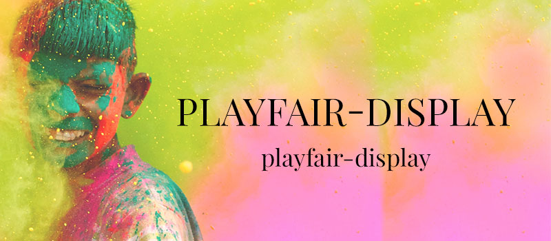
1. Playfair Display
The perfect font for banner titles would be Playfair Display font. It is not a traditional Display font, but it is named so as it was extensively used for display use. There has been a staggering increase in brands using bold, high-contrast serifs in the logos and copies; it is expected to be a trend in 2022 as it leaves a deep humanizing effect for brands using them.
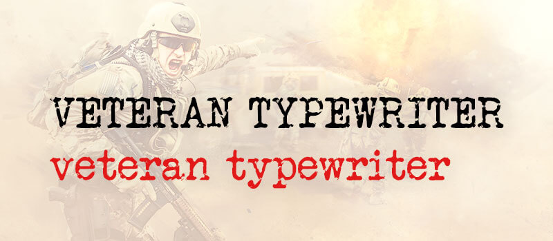
2. Veteran Typewriter
If you are looking for a font for banner that is easily readable and emulates typewriter letters, Veteran Typewriter can be the ideal one for you. It resembles a Serif looking typeface and can be used for titles only. However, some designers and marketers do use it for call-to-actions too. When used correctly, these banner fonts can look quite stylish, which will be the foremost thing in 2022.
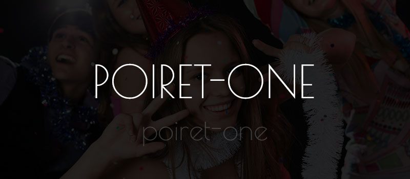
3. Poiret One
Poiret One font style for banner design looks decorative, geometric, as well as innovative. It can be effectively used for titles, headlines, logos, labels, and signs. If you have a short message that you want to convey with a stylish font banner design, you can use it for body text. You should use it in lowercase even though it looks appealing in all caps. Poiret will reflect simplicity and straightforwardness with the friendly geometrics.
4. Luckiest Guy
One who can draw attention in a few seconds – he’s the Luckiest Guy font style for banner design. Obviously, best font for banner titles. The font is similar to handwriting but written as a bold typeface. Note that it is available as Regular style, with uppercase letters only.

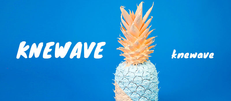
5. Knewave
If you do not prefer to use Luckiest Guy, you can use Knewave for your titles. Its bold typeface can emphasize the message you want to convey through the banner. This banner design font comes in a regular style and supports lowercase letters in an Italic style. Luckiest Guy and Knewave, both these fonts for banner design will get more popular in 2022 because of their custom hand-lettered typeface.
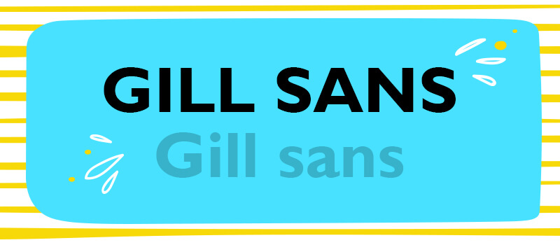
6. Gill Sans
Some fonts are evergreen and one of them is Gill Sans designed by Eric Gill. He designed this Sans Serif font, according to the 1916 Underground Alphabet, the font of the London Underground.
The history of this font dates back to 1928 when it was released by Monotype to combine a modern as well as classical look. British Railways used this font for their posters and timetables. It was also used for the titles of Penguin books.
It is also used in BBC’s logo. They did create their own typeface known as Reith, but their logo still remained to be Gill Sans.
7. Avant Garde
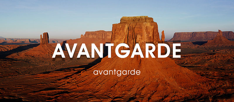
Avant Garde is a revolutionary font designed by Herb Lubalin for the logo of Avant Garde magazine. It gained instant success and eventually became an individual font. The letters are in perfect alignment with each other, thereby being apt for titles and logos alike.
8. Franklin Gothic
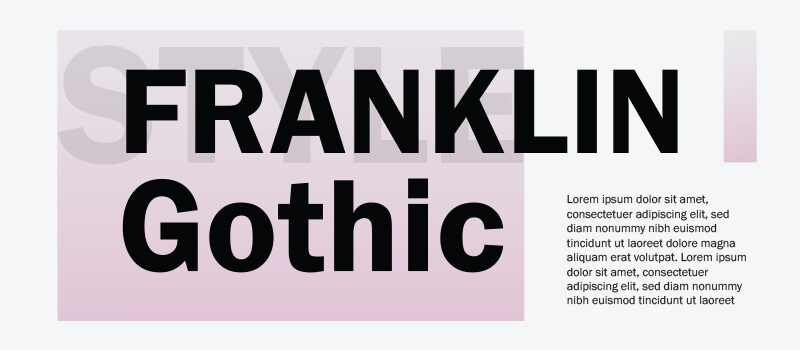
In the early 20th century, Morris Fuller Benton designed the Franklin Gothic typeface that got immense popularity for newspaper headlines and advertisements. If you want your headline to stand out and grab the reader’s eyeballs, this is one of the perfect banner fonts for you.
Body Text
1. Source Serif Pro
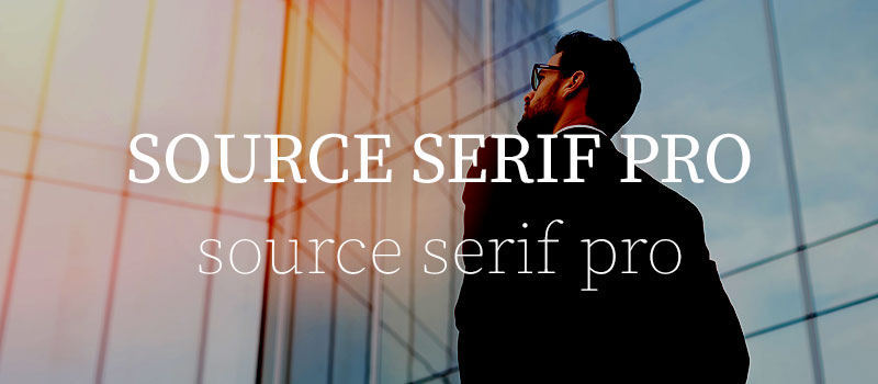
Banners with longer text should use Source Serif Pro font. It is similar to the Volkhov font, just a bit thinner than the latter. As it is elegant and easy to read, it works well with all kinds of banner copies, irrespective of their length.
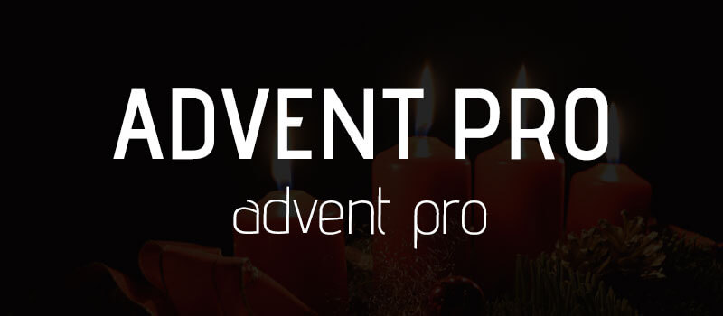
2. Advent Pro
You have seven different styles to choose from, in this font.
- Thin
- Extra-light
- Light
- Regular
- Medium
- Semi-bold
- Bold
Advent Pro is suitable for banners that have a simple monochrome background. However, you can use it for any banner owing to the multiple styles it is available in.
3. Open Sans
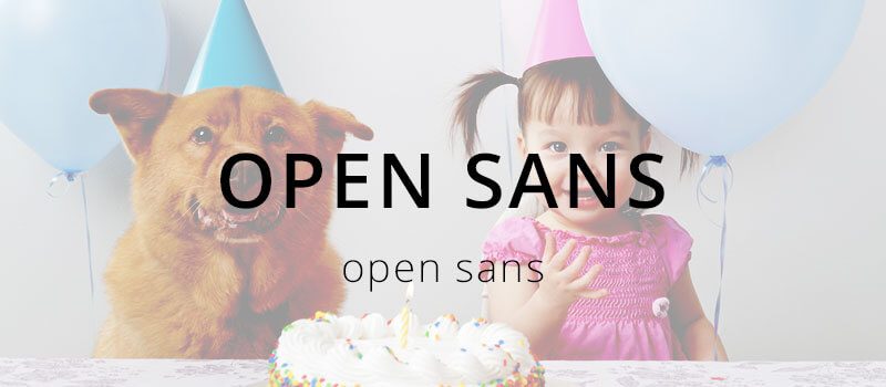
If you want to create banners that are clean, readable, and look great on mobile devices, Open Sans is the right choice for you. The main advantage of this font is that it contains a complete 897 characters set and is available in all the major languages, including Greek and Cyrillic.
4. Rock Salt
Marketers who want to impart an innovative appearance to their banners in 2022 and cut through the digital noise can use Rock Salt font. If you are looking forward to advertising comic books for children, this is the best font for banners. You can find it only in Regular style and uppercase.

5. Short Stack
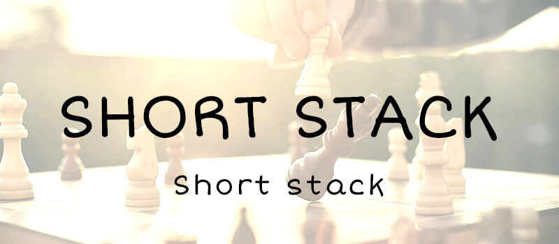
Short Stack and Rock Salt are quite similar but the former comes with lowercase letters too. It has a semi-geometric font for banners and low contrast look that looks like handwriting in block letters. It can be used for texts ranging from medium to large sizes.
6. Sacramento
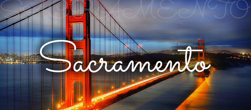
Sacramento is one of the most accurate Script typefaces with stylish and round letters that resemble traditional handwriting. It will perfectly complement your title or body text in the banner. If you like an italic typeface, you can use Parisienne Script font that comes with a rightward slant and emulates human handwriting.
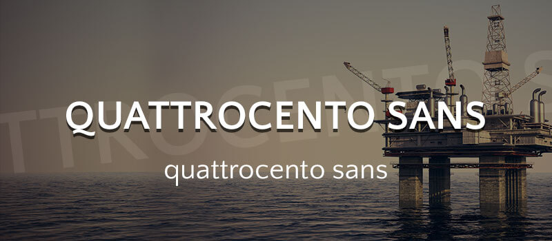
7. Quattrocento Sans
Copy written in Quattrocento Sans oozes warmth and gives the banner an elegant look. If you have to accommodate long phrases, Quattrocento Sans font for banners works the best because it is legible even in smaller sizes.
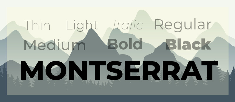
8. Montserrat
Montserrat is one of the most versatile fonts for banner design as it is available in 18 different styles, ranging from thin to extra bold. Highlighting different messages or lines of text in the same typeface is easily possible with this font. Keeping the trend in view, Uplers uses the same font in their website and most of the typography banner copies.
Best Practices for Combining Different Typefaces
1. Pair a sans serif title with serif body text
One of the most widely used (and safest) combinations is a sans serif header and serif copy text. Using two sans serif or two serif typefaces can lead to tension in the design and therefore should be refrained from using together.
2. Do not use typefaces of the same classification together
Avoid the usage of fonts from the same classification but different typeface families as they have different personalities and lead to disconnect in the copy. It is recommended you use typefaces from different classifications.
3. Let the fonts play different roles
Whenever you are designing a banner, make sure that you choose the header, body text, as well as the CTA fonts in such a way that they are able to play the role they are intended for. Just bear in mind that do not use too many typefaces in the same banner as it might get confusing for the reader.
4. Use contrasting font weights
While the header text of the banner should use a bold typeface, the copy should have a regular font style so that the reader can easily differentiate between the two. By doing so, the header text will draw maximum attention.
5. Work on creating diverse typographic colors
Typographic color refers to the cumulative effect created by the variations of font weight, size, leading, kerning, stroke width and some other parameters. You can see typographic colors by squinting at a layout until it is no longer readable but visible in terms of its tone. Clever usage of bold, bold and italic, and regular font faces can help create different typographic colors and make the banners more readable and impactful. You can also use different point sizes if you want to use the same font. It will increase the variety of typographic color.
Wrapping Up
Text banner design can get tricky, considering the intense competition in the digital marketplace. That’s why it becomes all the more important to convey the right message to the audience in the right way. Pick the design of your banner and its font wisely so that it gets the attention it deserves and brings you closer to your goals.
We would love to learn about your font of choice when it comes to designing banners. Do let us know in the comments below.



Thank you for your sharing. I am worried that I lack creative ideas. It is your article that makes me full of hope. Thank you. But, I have a question, can you help me? https://www.binance.com/pt-BR/join?ref=RQUR4BEO