[This post was originally published on 27th Oct 2021. It has been updated on 30th Aug 2022.]
Three weeks before Christmas 2021, Sarah purchased $750 worth of gifts from your eCommerce store. After completing the payment, she expected to receive a confirmation email saying, “Thank you for your purchase. Your gifts will be delivered within 10 days to your recipients. Here’s a promo code for 10% off on your next purchase!” Sarah didn’t receive any such order confirmation emails. Disappointed, confused, and frustrated, she canceled her order.
You own and operate an aggregator website that provides good deals on plane tickets, hotel rooms, and travel packages. Paul is traveling from London to Dusseldorf in January. He booked a hotel room from your website, expecting to receive a booking confirmation email. But he didn’t. Unsure if the transaction actually went through, he canceled his booking.
Abdul signed up on your website to receive a weekly newsletter. He expected (and preferred) to go through a double opt-in to confirm his subscription. But since he didn’t receive such an email, he got worried that you would spam him. As soon as he received your first newsletter, he unsubscribed and marked your emails as “spam”.
Every subscriber in these situations expected to receive a confirmation email but didn’t, so all three severed their relationship with the brand.
Confirmation emails are important. But a lot of marketers ignore these emails and don’t add them to their email marketing strategy.
Want to reassure customers, thank them for their support, gain their trust, and build long-term relationships? Send out confirmation emails!
This guide has been designed to show you how. Make sure you save it!
Why You Should Send Confirmation Emails
How to Set Up Confirmation Emails
Best Practices to Get the Best Results from Confirmation Emails
Confirmation Email Examples to Inspire You
What is a Confirmation Email?
A confirmation email is a type of transactional email sent to a recipient following a particular action or after a certain condition is triggered. Simply put, an email confirmation message confirms something that the customer did or asked for. It is your brand’s way of saying, “Yes, we hear you and appreciate you. Here’s the information you need. We hope it keeps you coming back for more!”
Types of Confirmation Emails
Here are some essential confirmation emails that you should seriously consider sending for your brand.
Purchase confirmation emails: To thank a customer for placing an order at your online shop with information like:
- Product details
- Shipping status
- Warranty details
- Terms and conditions
- Refund options
Newsletter Subscription confirmation emails: When someone subscribes to your brand’s newsletter
Order confirmation emails: In response to a traveler booking tickets, a hotel room, or a travel package on your website
Event Registration confirmation emails: Immediately after someone registers for your webinar or some other event
Appointment confirmation emails: To confirm someone’s appointment at your business
Why You Should Send Confirmation Emails
Can an informative, to-the-point email confirmation message help you engage better with subscribers, and garner their loyalty?
Answer: Yes and yes.
Confirmation emails may seem like simple, automated, and transactional emails whose main purpose is to tell a recipient, “Thank you. Here’s the information you asked for.” However, a confirmation email can also yield many other benefits:
Win the battle for the inbox
The average office worker gets around 120 emails per day. And in 2020, marketing emails had an open rate of just 20.56%. In this busy, noisy world, confirmation emails can help you win the battle for the inbox because the inbox is where such emails land, and because they have an open rate of 70%.
Connect with customers right from the get-go
A confirmation email is an easy and effective way to connect with subscribers on a personal level from the very first time they interact with your brand. By engaging with them early, you have a better chance of keeping them engaged, and turning them into lifelong customers, and brand advocates.
Increase click-throughs and conversions
Welcome emails, abandoned browse and cart emails, and loyalty reward emails tend to get a click-through rate (CTR) of 4%. But confirmation emails do even better, with a high CTR of 17%, proving that these messages offer an effective way to not only reinforce the connection with customers but also to increase conversions and sales.
Useful information increases anticipation and reduces frustration
Some users check their emails 20 times a day to ensure that they don’t miss anything important. Clearly, brands have a great opportunity to share useful information with their subscribers through confirmation emails. Also, since confirmation emails are triggered by a user’s actions, subscribers expect such emails, which means that they notice, open, and engage with confirmation emails more than they do with other emails. Conversely, when they don’t receive confirmation emails, they might get frustrated and even lose their enthusiasm for your brand.
Get to know your customers better
By sending confirmation emails, you can learn more about customer behaviors and preferences and tailor your email marketing strategy accordingly. So if Sarah has bought Christmas gifts from you before, or Paul has expressed interest in travel packages for spring, you can use this information to design other campaigns with personalized offers to keep them interested for longer.
Grab upsell and cross-sell opportunities
As you deepen your understanding of subscribers with confirmation emails, you can find upsell and cross-sell opportunities to increase your sales over time. At the same time, subscribers will appreciate receiving special offers, discounts, and sales notifications tailored to meet their needs, which will build trust in the brand and keep them coming back in the future.
All of these are powerful reasons for sending confirmation emails. Moreover, it’s easy to set them up with the right tools and with an expert email marketing partner like Email Uplers.
How to Set Up Confirmation Emails
It’s easy to set up confirmation emails messages with an Email Service Provider (ESP) or email automation software, and the step-by-step process is described below:
Step 1: Create an Opt-In Email List
A confirmation email should only be sent to those who agree to receive your email communications. Getting subscriber permission in advance is vital to ensure that you only email those who want to hear from you and also remain compliant with email laws like CAN-SPAM. So first, create an opt-in email list. One of the easiest ways to do this is by asking users to complete a form on your:
- Website
- Landing page
- Checkout page
- Social media
Your ESP may provide built-in form templates, so you don’t have to design your own from scratch. Keep the form simple, and use clear, unambiguous language.
Once you receive a subscriber’s form, you can send them the first confirmation email thanking them for signing up. This is where you include a “double opt-in”, so they have to confirm their subscription to receive further emails. This extra step verifies their email address and confirms that they still want to receive emails from you. With this initial email, make sure that you:
- Clearly communicate that the user is subscribing to an email list
- Include an “opt-in” checkbox or a “confirm subscription” link
- Set clear expectations as to what kind of content they can expect to receive, how frequently, and what value you hope to provide
If possible, include an “update preferences” or “update profile” link to allow subscribers to change their preferences to receive the information they want when they want it. This information will reflect in your ESP and help you get to know them better. Research has found that 67% of users unsubscribe because emails come too frequently. By asking them their preferences and then respecting these preferences, you can build a positive relationship with them through purchase and beyond.
Step 2: Select And Set Up Triggers
Your ESP will provide multiple trigger options, so you can set up different kinds of automated confirmation emails, such as:
- Thank you for joining our email list
- Thank you for your purchase
- Shipping confirmation
- Newsletter subscription
- Appointment confirmation emails
- Booking confirmation
- Registration confirmation
- Order confirmation
- Event registration
- Download confirmation
Step 3: Set Up Email Confirmation Workflows
After setting up triggers, set up the automation workflow for each trigger and each email confirmation message. Your ESP should provide various workflow options to help you set up and automate each type of message. Include any necessary conditions, especially if you plan to send more than one confirmation email for a particular purpose.
Example
When someone joins your subscriber list, you may send them a “thank you for joining” confirmation email with a double opt-in button. But what if they don’t open this email? You may lose out on this subscriber since they have not confirmed their subscription. In this case, you can add a condition in your ESP to send a reminder email after waiting for a certain period.
You can also set up workflows and conditions to:
- Send reminder emails (you can set up the number and frequency) to contacts who did open the first email but didn’t click on the confirmation link
- Send follow-up emails to contacts who both opened and clicked on the confirmation button
Keep in mind these best practices when setting up conditions and workflows:
- Try different subject lines for reminder emails
- Experiment with content and design
- A/B test different versions of emails before finalizing one version
- Understand different customer behaviors to identify specific triggers and guide your workflows
- Optimize send times and frequencies. For example, “thank you for signing up” or “thank you for your purchase” emails should go out immediately, not a few days (or weeks) later
Step 4: Create Content For Each Confirmation Email
Once you have your subscriber list, triggers, and workflows and conditions, design your confirmation emails. Different confirmation emails happen at different touchpoints and phases of the customer lifecycle – and the content should reflect this.
Many ESPs provide readymade templates and content blocks to help you create different confirmation emails quickly. Select a template, customize it per your needs, and set it up with the right triggers and conditions. Make sure you:
- Review your settings
- Set up metrics to track email performance (e.g., opens, click-throughs, and unsubscribes)
- A/B test every email and select the “best” version, i.e. the version most likely to be opened by your audience
Example 1: “Thank you for signing up” Confirmation Email
A user who just signed up to receive your email communication through a sign-up form on your website is still at the start of the journey. So, a confirmation email thanking them for signing up should include content like:
- Details about the subscription
- Double opt-in button to confirm the subscription
- Email preferences link
You could also include content like:
- Special offers for new customers
- Information about your brand
- Customer service information, e.g. 24×7 phone hotline, email address, etc.
- Product recommendations
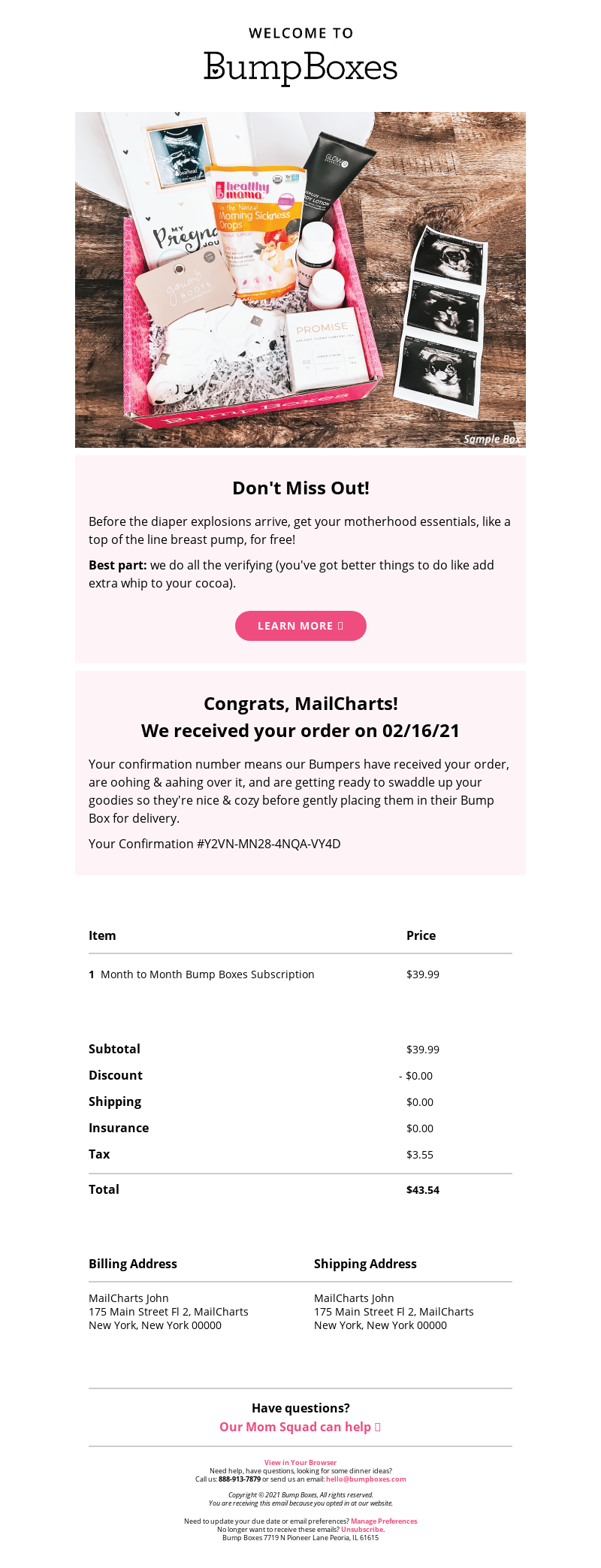
This email from BumpBoxes fits the bill with a clean layout, detailed information, and personalized greeting.
Example 2: “Thank you for your purchase” Confirmation Emails
Someone who has just purchased something from your online store expects to receive confirmation emails immediately after their payment goes through. Obviously, this subscriber is further down the purchase journey, so your content should include details such as:
- Order number
- Payment information
- Shipping information
- Customer service information if they want to follow up on the status of their purchase/shipping
- Other important information about cancellations or refunds
- Receipt print-out link/button
- Recommendations such as “you might also be interested in” or “other people also purchased”
Best Practices to Get the Best Results from Confirmation Emails
Confirmation emails are a powerful yet easy way to connect with customers early and stay in touch with them throughout their brand journey. With the right ESP and right email marketing partner, there’s really no reason for you not to add confirmation emails to your email marketing program. That said, it’s helpful to keep in mind some best practices to ensure that you can get the most value from your confirmation emails.
Make Emails Visually Appealing
A confirmation email is always sent in response to a trigger. But this doesn’t mean that your messages have to be bland or generic. Every confirmation message can be personalized for a user, tailored for their purpose, and visually appealing.
By all means, use readymade templates in your ESP. But also make sure that each email:
- Creates a visual impact in terms of design, graphics, colors, and fonts
- Features a clean layout with the various elements laid out clearly. With confirmation emails, less is often more
- Has a consistent look and feel with your brand’s communications (logo, colors, etc.)
- Includes carefully chosen images and emojis that load quickly on user’s devices
- Clearly shows the call to action (CTA) links or buttons so users can see exactly what action they need to take
- Don’t leave them hanging and wondering what to do next
- Provide clear instructions in simple language
- CTA text/word choice, button placement, colors, white space are all important, so get them right!
- A/B test different versions and send out the version that a maximum number of people find appealing and “open-worthy”
Always Use Double Opt-in
We mentioned this earlier. When setting up subscriptions for your brand’s confirmation emails, it’s always a smart idea to use a double opt-in. Even if it feels like additional work, the effort will be worth it. A double opt-in simply means that the subscriber first signs up for your emailing list – usually via a form – and then confirms that they want to stay signed up by responding to an automated confirmation email that you send via your ESP.
Why double opt-in?
- You’ll be certain that those who sign up are already engaged, and therefore more receptive to receiving other communications from your brand
- Special offers
- Sales notifications
- Engagement and re-engagement emails
- Abandoned cart emails
- Abandoned browse emails
- Event invites
- Surveys and feedback requests
- Referral emails
- You’ll have multiple opportunities to connect with them via multiple email messages upon signup
- You can reduce your bounce rate and spam complaints
- You can lower unsubscribe requests
Further, when you implement a double opt-in strategy, if a site visitor somehow subscribes to your emails by accident, the subscription won’t go through unless they confirm via the verification button sent to their email address. This is a great way to ensure that you don’t end up emailing people who are unlikely to engage with you, or worse, likely to label you a spammer. Your email list will be “cleaner”, since it consists of those who want to receive your emails, which means that you can expect a higher ROI from your email marketing efforts.
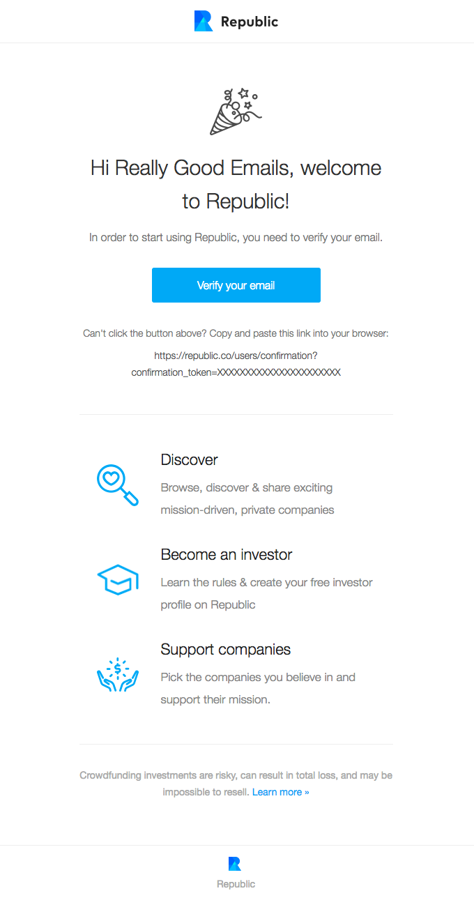
Here’s how Republic ensures that its subscriber list contains captive users who want to hear from the brand:
Stick To The Purpose Of The Email
The purpose of a confirmation email is to confirm an action that a user takes. For example, they:
- Confirmed a subscription to your newsletter
- Purchased something from your store
- Registered for an event that you are hosting or organizing
- Booked something on your website, e.g. a restaurant table
- Registered on your website, e.g. for self-service bill payments
In some cases, you may send out a confirmation message based on your action that you’d like to update a user about:
- Shipping confirmation
- Appointment confirmation
- Download confirmation
With every confirmation message, it’s important to stick to the purpose.
Are you sending an appointment confirmation email? Then make sure it contains details about the appointment, such as:
- User’s name
- Appointment time
- Appointment place
- The person they will be meeting
- The type of appointment, e.g. health checkup, hairdressing appointment, etc.
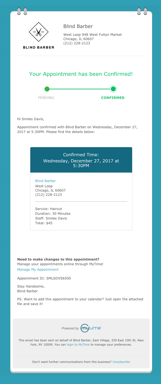
This appointment confirmation email from Blind Barber includes all the useful information a person may need about their appointment time, location, service, cost, etc.
Don’t confuse the recipient with unnecessary information that has nothing to do with their upcoming appointment.
Similarly, a purchase confirmation email should contain information relevant to that purchase only:
- User’s name
- Order number
- Product name
- Amount paid (including taxes and shipping charges)
- Expected arrival/delivery date
- Shipping address
- Shipping method
- Company contact information or support details (call center, email address, etc.)
It’s perfectly okay to include upsell or cross-sell recommendations to encourage further purchase. However, it’s usually better not to include irrelevant information like:
- Event invite
- Link to an ebook, white paper or other downloadable asset (unless it’s related to the purchase)
- Unrelated product recommendations,if the email subject has nothing to do with an event, ebook or other products.
Keep in mind these simple best practices:
- Keep it short and sweet. Say what you have to say quickly to get – and keep – their attention
- Include all important information above the fold. If possible, limit the email to a single scroll. You don’t want users to have to scroll multiple times to find the most relevant information!
- Always include the subscriber’s first name in the greeting
- Include your brand’s logo and contact details
- Incorporate a CTA button wherever appropriate. Use unambiguous text, and make sure the button is clearly visible
- Include accurate details, especially for confirmation emails that involve money, e.g. purchases or bookings
Also make sure the subject line clearly mentions the email purpose so the subscriber can locate the message easily in their (crowded) inbox:
Possible subject lines for appointment confirmation emails:
- Your appointment with X is confirmed
- Please note your appointment details with X
- Your appointment details with X
Possible subject lines for order confirmation emails:
- We have received your order
- Your order has been placed
- Thank you for your recent order with X
- Details of your order with X
Personalize Every Email
If you have implemented double opt-in, you already have a list of captive subscribers. You can then leverage your ESP to segment your entire subscriber list, and thus make sure that:
- Each person receives the correct email based on a specific trigger
- Each email goes out at the right time (e.g. immediately after purchase, registration or appointment booking
- You personalize each confirmation email for each subscriber
Confirmation emails already have a higher open rate and CTR than almost all other types of emails. However, by personalizing each confirmation message, you can increase the chances that a subscriber will remain engaged with your brand. Keep sending different kinds of confirmation emails – each personalized to that user – and you will most likely be able to:
- Get subscribers to take some action that benefits you as well as them (win-win!)
- Garner long-term subscriber loyalty
- Increase repeat purchases
- Improve results from cross-sells and upsells
- Get more referrals through word-of-mouth marketing
Here are some ways to include personalization in your confirmation emails:
- Craft a compelling subject line that addresses something that’s unique to that subscriber, e.g. their first name, company name, etc.
- Include personalized branding in every email
- Address them by their first name
- Create tailored copy with a unique value proposition for every subscriber
- Use warm, human-sounding copy, not copy that sounds stiff, generic, or machine-generated
- Use casual language and a cheery tone wherever possible
Users find confirmation emails useful since they provide information that’s relevant to them and in a timely manner. But you can still wow them with content that’s friendly, positive, personalized, and highlights the brand’s value. Also, clearly communicate “what’s in it for me?” so the subscriber knows what they’re getting in an easy, no-friction/no-overwhelm way.
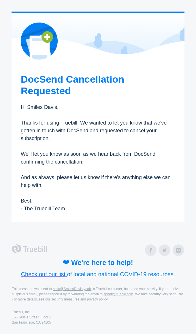
This confirmation email from DocSend is in response to a cancellation request from a user. Despite the “negative” event for the brand, the email is still personalized, warm, and focused on the user.
Personalize the “From” Field
When you send confirmation email from john@thiscompany.com, you are more likely to get engagement and action from your subscribers. A “From” field that includes a real person’s name and your company’s name provide the “human factor” and also lend more credibility to your brand. Also, your subscribers are much more likely to open these messages, if they know they were written by a human being for a human being.
On the other hand, a “no reply” in a message (e.g. noreply@thiscompany.com) prevents recipients from responding to your emails. This will frustrate them and increase the chances of unsubscribes.
Use a dedicated email address to send out confirmation messages. Also leverage your ESP to collect all responses in a central location, so you can answer customer emails quickly. This kind of customer focus will help develop your reputation as a brand that cares about its customers.
Make Every Email Mobile-Friendly
Did you know:
- Mobile opens account for 46% of all email opens
- Mobile-responsive email designs can increase unique (mobile) clicks by 15%
- 59% of millennials and 67% of Generation Zers primarily check their email on smartphones
And yet, nearly 1 in 5 email campaigns are not mobile-optimized!
As the use of mobile devices increases, you have an effective and high-touch way to get subscribers to open your confirmation emails. That’s why it’s important to ensure that every confirmation emails that goes out from your brand is mobile-optimized. Use email templates that adapt well for all kinds of screens. Select a layout, design and graphical elements that translate well into smaller screens. Use easy-to-read fonts, and ensure that all graphics (emojis, photos, GIFs, videos, etc.) load quickly on mobile screens. Test all links and buttons to make sure that everything works the way it’s supposed to.
Other best practices to create mobile-optimized confirmation email examples:
- Make sure the text is legible and easy-to-read
- Use “responsive” email templates
- Select a clean layout with well-organized, clearly visible and limited content
- Include ALT text on every image so even if the image doesn’t load properly, the user can still understand what it’s meant to say
- Use white space and contrasting colors for better readability
- Use short subject lines and effective pre-header text
- Include a punchy top headline
- Limit the number of scrolls (1 is ideal) so the user can quickly get the gist of the message
Confirmation Email Examples to Inspire You
Ready to get started with creating confirmation emails for your brand? Take a look at the best confirmation emails below for inspiration!
1. Signup Confirmation Emails

This adorable signup confirmation email from Jojo Maman Bébé does a great job of connecting with mothers right from the get-go. With high-quality images of children (Jojo is a boutique mother and baby brand), colors that remind mothers of children (pink and blue), useful links, and a friendly “from” address, Jojo’s signup confirmation emails ticks all the right boxes. It also includes a promo code right at the top to entice mothers to continue shopping.
2. Double Opt-in Confirmation Emails
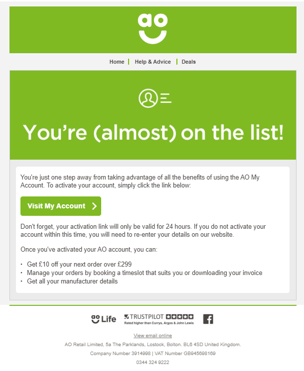
This simple email from AO asks users to confirm their registration by clicking on a simple CTA button. It specifically mentions that the link is only valid for 24 hours so the user is required to take quick action. The message also clearly calls out the benefits of signing up (“what’s in it for me?”) so the user can easily see what they stand to lose if they don’t sign up.
3. Purchase Confirmation Emails

PuraVida’s order confirmation emails does everything right:
- Detailed purchase information
- Customer shipping and billing information
- Shipping method
- Payment method used
- Help email address
The language is casual and upbeat in keeping with the brand’s tone. The message also includes discreet cross-sell links to encourage the customer to keep shopping.
4. Shipping Status Confirmation Emails
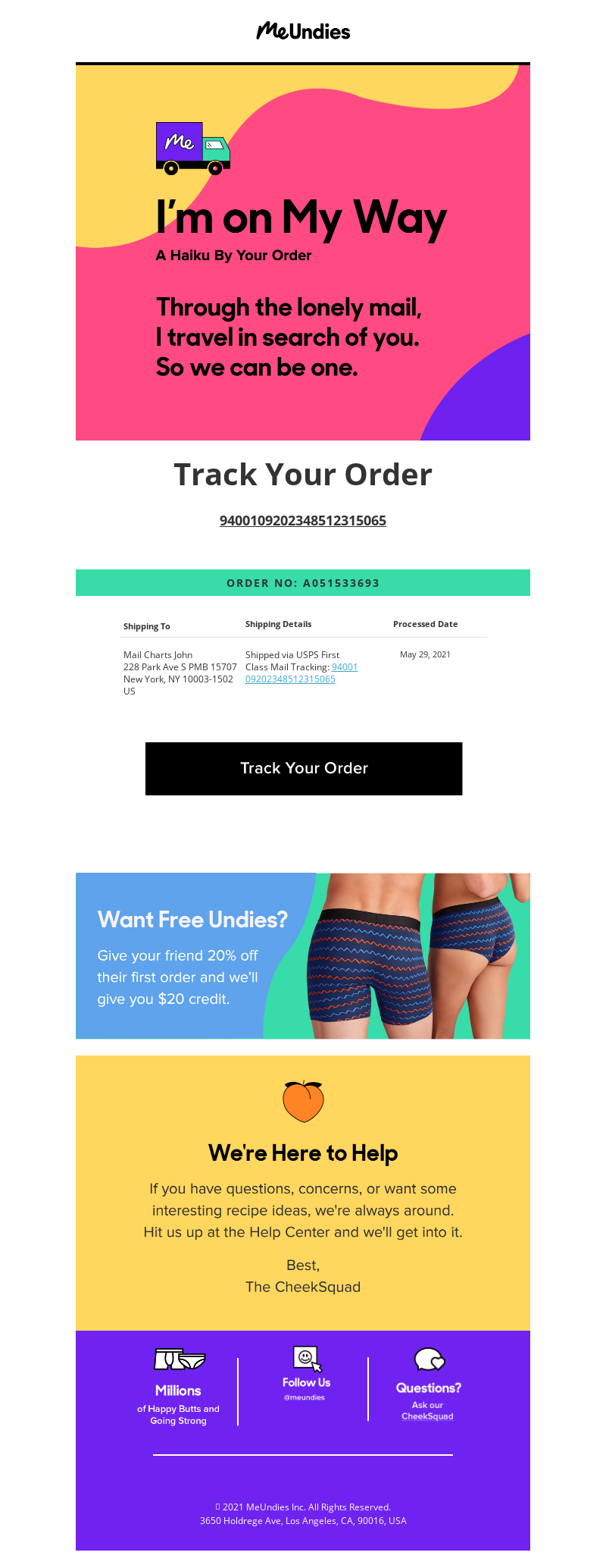
This shipping status email from MeUndies gets the right balance between irreverent, humorous, and useful. To start, it makes the customer laugh, and then jumps right into their order details and shipping status. Further down, it includes an enticing credit offer for referrals, as well as help information. The email sticks to the point, is short and sweet, but also includes a gentle encouragement to provide referrals (and thus increase the brand’s sales).
5. Post-booking Follow-up Email

The Greenbank Hotel likely sends confirmation email when a customer books a room with details of their order. This follow-up email goes out after the first email to stay connected with the customer and engage with them by asking for specific requests: flowers, chocolates, breakfast in bed, etc. While not technically a confirmation email, such follow-up emails further down the customer journey are a great way to retain the customer’s interest and garner their loyalty.
6. Booking Confirmation Emails

Here’s a confirmation email that every traveler will find useful. Frontier’s booking confirmation emails include important information about the user’s flight, as well as a useful checklist to reduce the overwhelm any trip can cause.
This reservation booking email from Resy is also useful and to-the-point. In addition to reservation details, it also provides a clear ‘cancellation’ button so if the user changes their mind, they can do it easily and without hassle.

7. Subscription Confirmation Emails
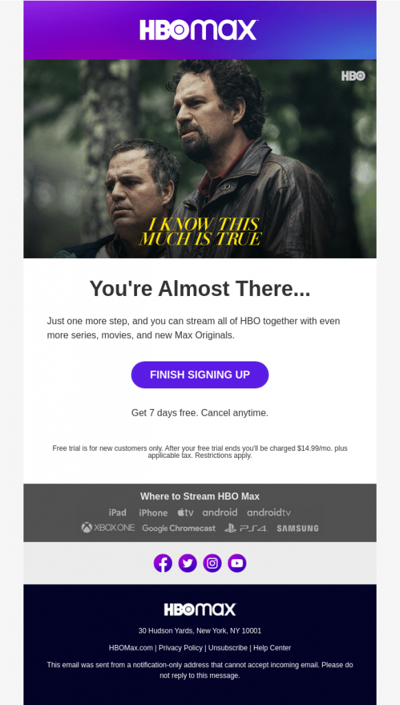
This email from HBO Max is sent out when a user signs up with the streaming service. It clearly mentions what the user needs to do to finish signing up. It also specifically states that the user has 7 free days and that they can cancel anytime.
8. Unsubscribe Confirmation Emails
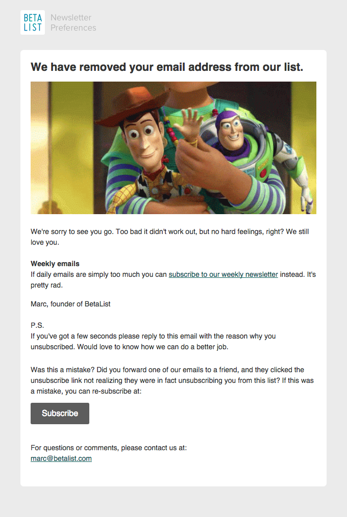
Sometimes your subscribers will want to unsubscribe from your emails. By providing an easy way to do this, you can show them that you respect their decision. A clear unsubscribe link will also allow you to remain CAN-SPAM compliant, and ensure that your subscriber list only includes captive and interested users.
This unsubscribe confirmation email from BetaList includes a simple message and a recognizable image from Toy Story which is likely to make the user think twice about leaving. The message also provides an option for a weekly newsletter for those subscribers who prefer not to receive daily emails.
9. Event Registration Confirmation emails

This event confirmation email from Litmus provides a clear event agenda that every attendee would appreciate having in advance. Although the email seems to have a lot of text, it is mobile-optimized, so mobile users can also clearly see the email and understand its key message.
Conclusion
By crafting useful, relevant and personalized confirmation emails, you can connect with customers, and grab more opportunities to earn their loyalty, build brand value, and boost sales, revenues and profits.
The email experts from Email Uplers can help you design and implement beautifully-crafted confirmation emails for many different purposes. Contact us to set up confirmation emails that acknowledge, impress and delight your users!


Neat blog! Is your theme custom made or did you download it from somewhere?
A theme like yours with a few simple adjustements would really make my blog stand out.
Please let me know where you got your design. Thanks